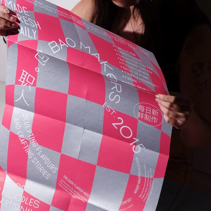
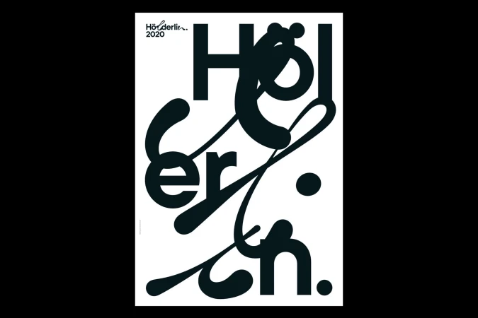
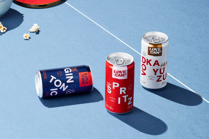
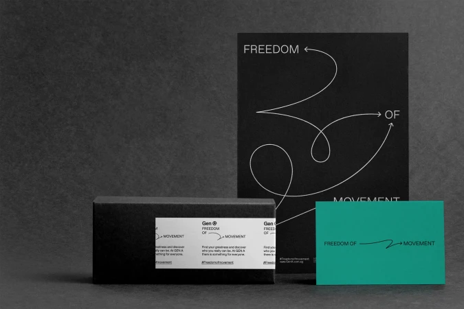
The brand identity for The Açai Collective serves as a masterclass in modern commercial design, where minimalist principles meet high-contrast visual storytelling. By synthesizing a cohesive system of packaging and print collateral, the project captures a fresh, vibrant aesthetic that leans into a bold monochromatic palette. The work effectively utilizes 3D render and CGI techniques to achieve a sense of precision, allowing the product to occupy space with a clean, cinematic quality. Throughout the series, the integration of halftone patterns and crisp, sans-serif typography creates a refined graphic language that feels both authoritative and approachable. The design team has curated an environment where food-centric elements—such as floating berries and chilled textures—are rendered with high-speed freeze clarity, ensuring the brand identity remains punchy and dynamic. Whether through the tactile appeal of matte-finished business cards or the carefully arranged compositions of food packaging, the project demonstrates a sophisticated understanding of luxury presentation and brand positioning. With soft light illuminating each detail, the identity avoids unnecessary clutter, favoring an editorial minimalism that allows the brand's core values to shine through. The collaborative efforts of the diverse creative teams involved, including Darling Visual Communications, Studio Hrastar, Common Curiosity, Robot Food, and Mel Yee, result in a final output that feels meticulously crafted, ensuring a lasting, professional impact across every touchpoint of the brand experience.