
Bao Makers: Brand Identity

Oct 2024
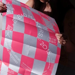
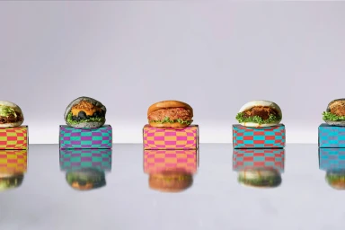
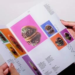
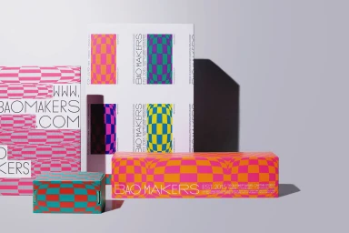
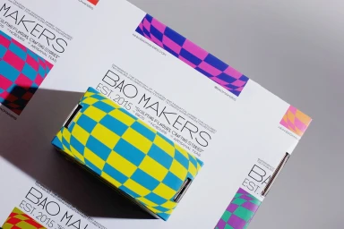
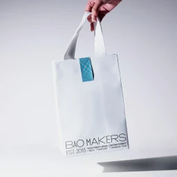
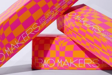
Darling Visual Communications developed the brand identity for Bao Makers, creating a comprehensive design system that spans printed collateral, packaging, and digital motion assets. The project leans into a bold, high-contrast aesthetic characterized by recurring checkerboard patterns in vibrant colorways, including magenta, orange, and blue, set against crisp white margins. Across both editorial and commercial applications, the visual language utilizes clean typography and structured layout design to emphasize freshness and craftsmanship within the food and beverage sector. The design suite incorporates dynamic motion graphics and 3D renders to showcase the packaging, while physical printed materials prioritize tactile paper textures and precise graphic composition. The identity is applied throughout the brand’s ecosystem, from menus and shopping bags to custom takeaway boxes and interior signage. The execution leverages vector graphics and screen print techniques to maintain visual consistency across all touchpoints.
Clean, Commercial, Graphic, Horizontal
White Seamless
