
Birmingham Design Festival: Brand Identity


Nov 2019
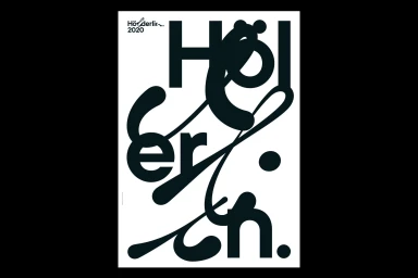
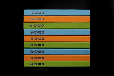
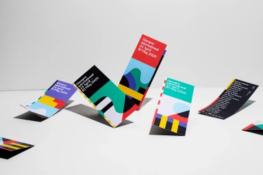
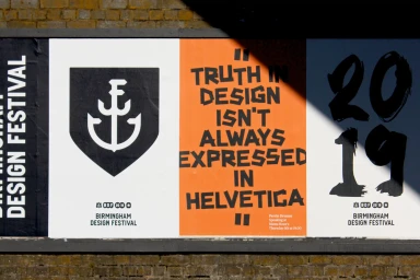
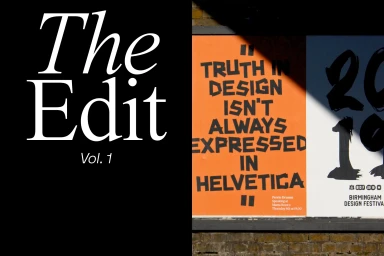
The brand identity for the Birmingham Design Festival stands as a masterclass in visual communication, seamlessly bridging the gap between high-concept artistic expression and functional corporate design. Across the series, the project showcases a sophisticated command of typography that serves as the backbone of its identity system. By utilizing experimental, bold black letterforms that occasionally veer into glitch-style distortion, the visual language challenges conventional design tropes—famously asking if truth in design must always be expressed in Helvetica. This bold, minimalist approach is balanced by a rigorous application of grid systems and a deliberate use of high-contrast color-blocking, where vibrant orange, teal, and lime hues cut through stark backgrounds. Techniques such as emboss and deboss add a tactile dimension to print collateral, while the interplay of hard light and dramatic shadow on outdoor installations emphasizes a three-dimensional, architectural presence. The project, brought to life through the creative vision of Luke Tonge, Sthuthi Ramesh, Ina Bauer, and the studios Two of Us and Common Curiosity, consistently prioritizes legibility alongside aesthetic disruption. Whether through the symmetry of color-blocked book spines or the dynamic, angular arrangement of promotional pamphlets, the identity feels both cohesive and fluid. It is a refined, tech-inspired study in modern brand identity that captures the energy of the creative industries through a lens of disciplined, cinematic precision.
Horizontal, Commercial, Clean
Advertising Campaign


