
Michael McManus: Brand Identity

Jul 2020
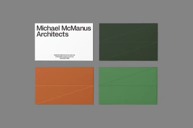
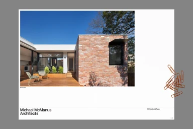
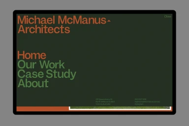
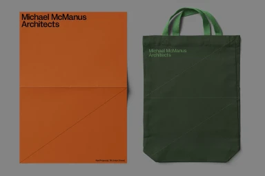
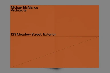
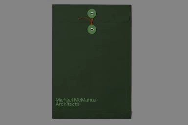
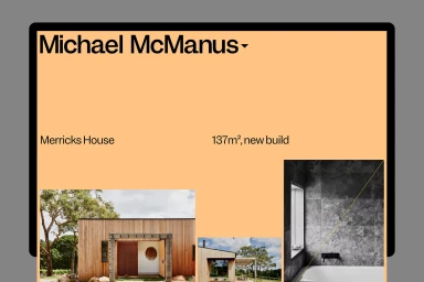
The brand identity for Michael McManus Architects serves as a masterclass in architectural precision, bridging the gap between traditional heritage construction and modern corporate sophistication. Developed by the design team at Grafik, the visual system leans into an aesthetic of editorial minimalism, where high-contrast sans-serif typography anchors a palette of matte forest greens, burnt oranges, and muted olives. This project effectively utilizes a consistent diagonal line motif across diverse collateral—from heavy-stock stationery and custom-labeled envelopes to canvas tote bags—to mirror the structural rigor of the firm's built work. The brand identity functions as a cohesive extension of the architecture itself, particularly when applied to the digital interface, where a structured UI illustration layout allows for a clean, professional presentation of case studies and project specifications. By harmonizing the raw, earthy textures of reclaimed brick and natural light photography with flat, geometric graphic elements, the design achieves a balanced tension. This corporate branding strategy avoids unnecessary ornamentation, instead prioritizing functional clarity and tactile quality. Whether presented on a high-end website layout or within physical documentation, the identity maintains a distinct, professional character that underscores the firm’s commitment to thoughtful, modern design in the competitive real estate and property sector. Every touchpoint feels intentional, framing the architectural practice with a refined, contemporary visual signature that is as precise as the structures they create.
Horizontal, Commercial, Clean, Minimalist
Typography
