
Sucre: Brand Identity
Jul 2023
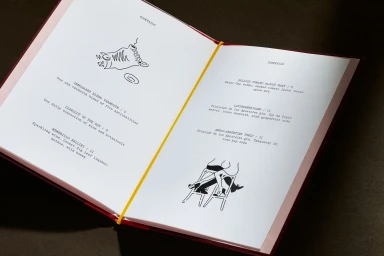
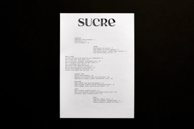
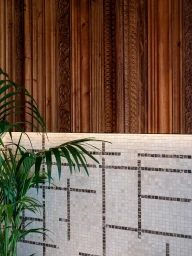
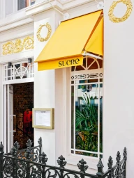
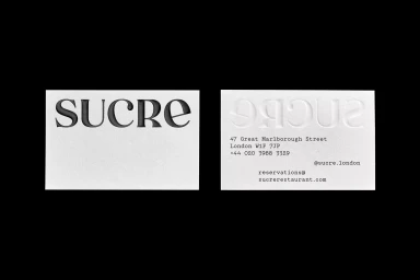
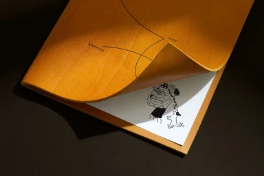
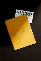
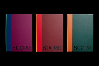
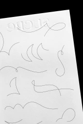
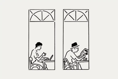
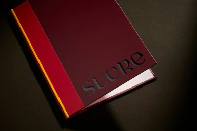
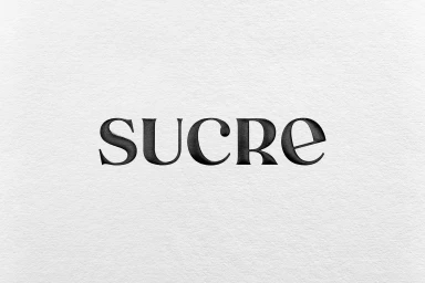
The brand identity for restaurant Sucre channels a refined, tactile aesthetic that leans into the interplay of print craft and spatial design. Developed by DutchScot, the project establishes a cohesive visual language through a mix of debossed typography, custom illustration, and a distinct, vibrant yellow accent color. Illustrator Rebecca Sutherland contributes a series of minimalist ink line drawings that appear across menus and stationery, pairing clean figurative work with typewriter-style text. The identity utilizes high-contrast materials, juxtaposing textured, matte paper stocks with deep black surfaces to highlight the precision of the debossed logotype. Beyond stationery, the branding extends into the architectural and interior experience, where architectural moldings and natural daylight define the restaurant's physical presence. The project balances organic textures with graphic, minimalist geometry to maintain visual consistency across all touchpoints.
Horizontal, Commercial, Clean, Minimalist
Advertising Campaign

