
St Paul's: Brand Identity

Brand
Date
Oct 2022
Description
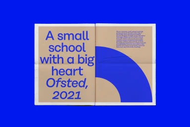
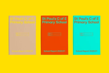
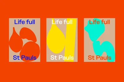
The District delivers a comprehensive brand identity system for St Paul's, characterized by a bold, primary-colored palette and a clean, minimalist layout. The project relies on geometric abstraction and balanced typography to establish a cohesive visual language across printed collateral and digital assets. Integrating flat color fills and vector-based shapes, the design emphasizes modularity and chromatic contrast. The identity is applied across school reports, printed booklets, and poster series, maintaining a consistent graphic style throughout the system.
Style
Horizontal, Commercial, Graphic
Techniques
Typography, Vector
Background
Solid Colour
Associated creatives

5000+ creatives to discover
Sign up to gain access to the entire directory. It’s free.
Visie is a curated library of creative professionals.