
Stavanger Ysteri: Brand Identity





Oct 2020
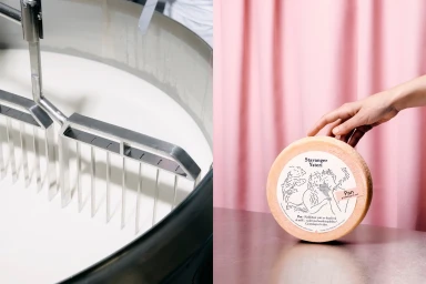
Stavanger Ysteri’s brand identity project bridges the gap between industrial dairy production and artisanal craftsmanship. Designed by OlssønBarbieri with illustration by Debora Szpilman, the visual system leans into a clean, minimalist aesthetic that highlights the textures of cheesemaking through a documentary-style lens. The project incorporates a series of monochrome ink illustrations and detailed typography that appear across product packaging, canvas totes, and marketing collateral. By juxtaposing the harsh, functional reality of stainless steel processing equipment and industrial hardware with warm, tactile shots of finished cheese wheels and paper labeling, the branding seeks to ground the product in its Norwegian production environment. The execution maintains a consistent visual rhythm, utilizing natural light to balance stark, commercial composition with expressive, artistic line work.
Horizontal, Clean, Commercial
Advertising Campaign

