
Shake-It: Brand Identity




Apr 2021
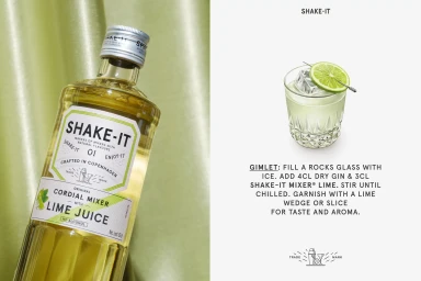
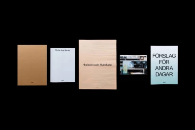
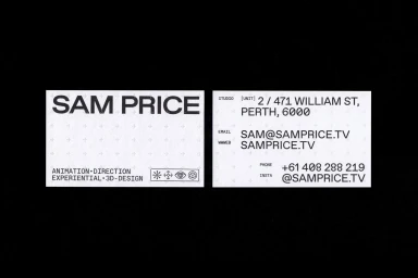
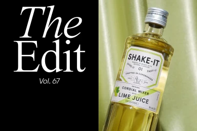
The brand identity for Shake-It presents a comprehensive visual language spanning product packaging, printed collateral, and large-scale environmental signage. This project channels a clean, minimalist aesthetic through typography-led design and tactical product staging, incorporating elements of editorial layout and graphic precision. Executed through a series of commercial photography setups, the project explores the interplay of color and texture against both saturated backgrounds and monochrome environments. The branding utilizes natural light to emphasize the materiality of glass, paper, and gold-toned surfaces, maintaining a consistent technical clarity throughout the assets. Development was led by OlssønBarbieri, Studio Reko, Twenty Assembly, Univers, and Gesture Systems. The identity work is presented across diverse mediums, from billboard displays in urban settings to detailed business card designs.
Horizontal, Commercial, Clean


