
Sourdough Disco: Brand Identity
Nov 2020
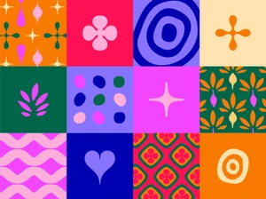
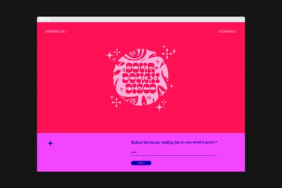
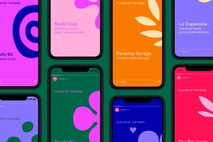
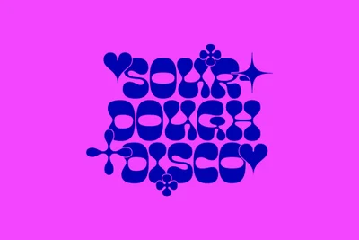
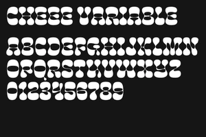
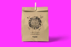
Sourdough Disco builds out its brand identity through a series of graphic design assets that lean into a retro and psychedelic visual language. The project comprises a flexible design system, moving from digital interface layouts and smartphone mockups to physical packaging executions. The visual framework relies on a combination of bold, saturated color palettes and bespoke bubble-style typography. Graphic design studio Order developed the alphabet and numerical sets, which feature organic, rounded forms, alongside a suite of abstract motifs including starbursts and floral icons. These elements are applied across various media, including web-based browser mockups and stamped-logo branding on physical assets.
Horizontal, Commercial, Graphic
Vector
