
O.P Guitars: Brand Identity


Brand
Date
Nov 2020
Description
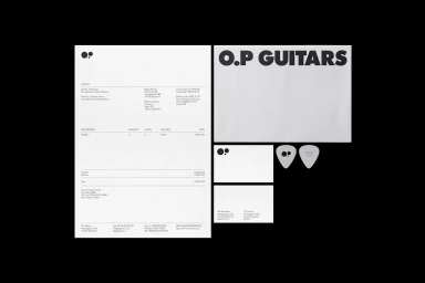
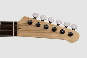
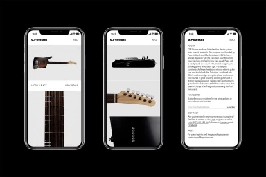
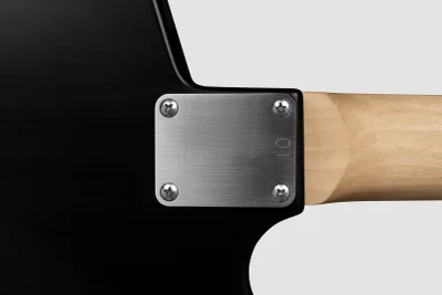
Studio Reko developed a comprehensive brand identity for O.P Guitars, establishing a clean, minimalist visual language across physical collateral and digital platforms. The project anchors the brand in a monochromatic palette, utilising bold uppercase typography and consistent, uncluttered layouts to define the company's presence. Creative execution spans stationary sets, apparel, and a responsive mobile interface. Technical documentation of the instruments themselves utilises macro photography and natural light to emphasise hardware precision and material textures, ensuring a cohesive aesthetic that aligns with the brand’s professional positioning.
Style
Horizontal, Commercial, Clean, Minimalist
Color
Jet Black
Associated creatives

5000+ creatives to discover
Sign up to gain access to the entire directory. It’s free.
Visie is a curated library of creative professionals.