
SARTO: Brand Identity

Feb 2020
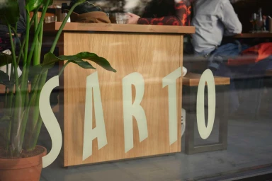
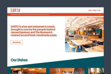
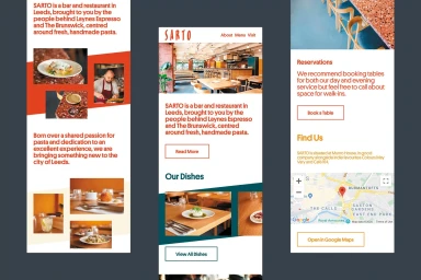
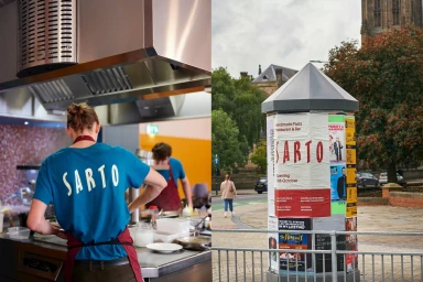
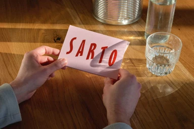
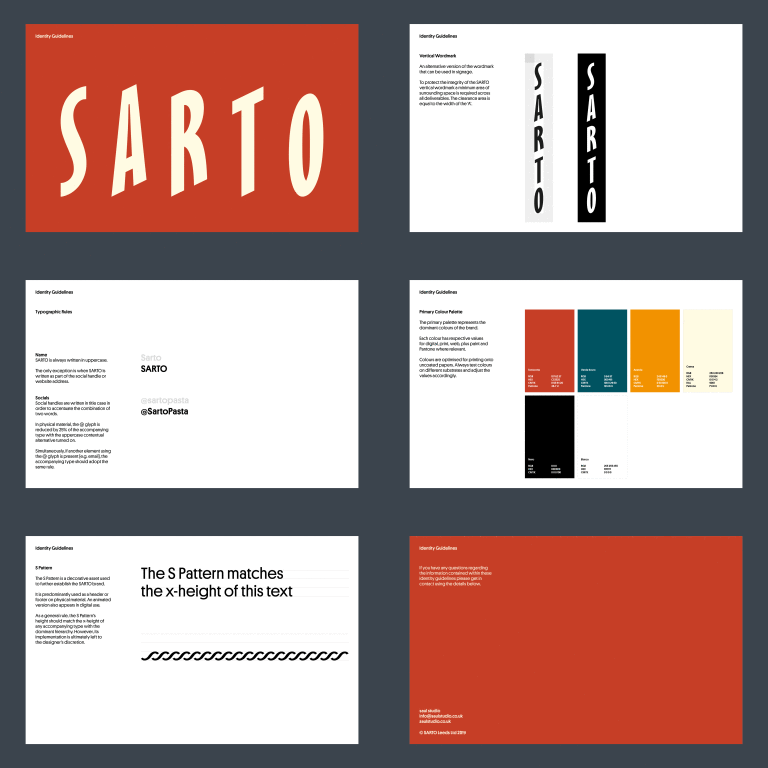
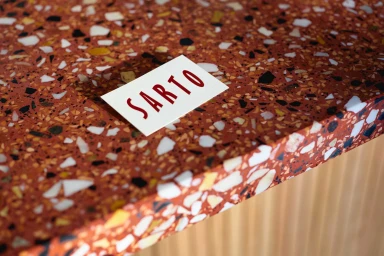
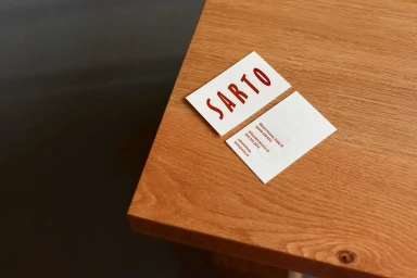
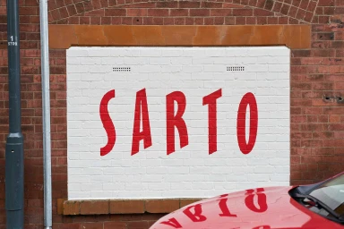
The brand identity for SARTO, a pasta-focused restaurant located in Leeds, serves as a masterclass in cohesive design and contemporary commercial aesthetics. Developed by Saul Studio, the project leans into a warm, inviting color palette of terracotta, deep green, and vibrant yellow to bridge the gap between high-end culinary craft and accessible urban dining. The visual system is underpinned by clean, minimalist typography, which appears across an expansive range of touchpoints including digital UI illustrations, staff uniforms, and physical stationery. By balancing these bold graphic choices with natural textures—such as the grain of wooden tabletops, the complexity of terrazzo surfaces, and the rugged character of exposed brick—the identity feels grounded yet aspirational. Every element, from the hand-drawn logotypes on business cards to the large-scale signage painted on brick, demonstrates a commitment to consistency and atmospheric storytelling. The use of natural light and soft, directional illumination throughout the project documentation highlights the tactile quality of the materials, allowing the brand to exist comfortably in both digital and physical spaces. By utilizing thoughtful color blocking and precise layout techniques, Saul Studio has successfully articulated SARTO’s position in the competitive food and beverage market, creating an identity that is as memorable as it is functional.
Horizontal, Commercial, Clean
Advertising Campaign
