
Rosamund: Brand Identity
Brand
Date
Feb 2022
Description
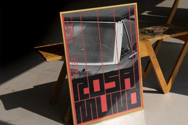
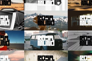
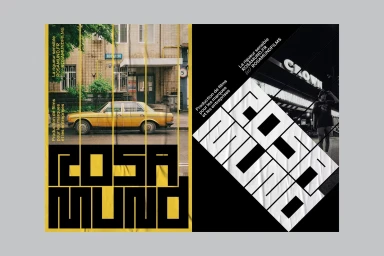
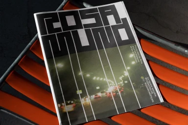
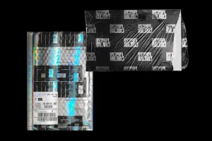
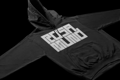
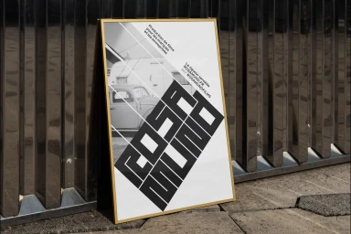
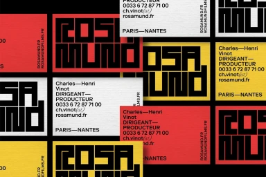
Brand Brothers lead the graphic design and brand identity development for Rosamund, establishing a comprehensive visual system that balances heavy typographic weight with sharp, geometric structure. The project encompasses a diverse range of assets, including print posters, stationery, custom packaging, and apparel. Techniques such as collage, analogue film textures, and minimalist layouts define the brand's aesthetic. The design relies on a bold, high-contrast palette and specific typographic hierarchy to bridge the gap between retro photographic elements and contemporary commercial print production.
Style
Commercial, Clean, Horizontal
Techniques
Typography
Color
Jet Black
Pure White
Context
Advertising Campaign
Associated creatives

5000+ creatives to discover
Sign up to gain access to the entire directory. It’s free.
Visie is a curated library of creative professionals.