
ROOTINE: Brand Identity



Nov 2020
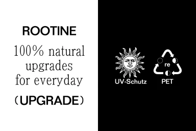
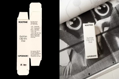
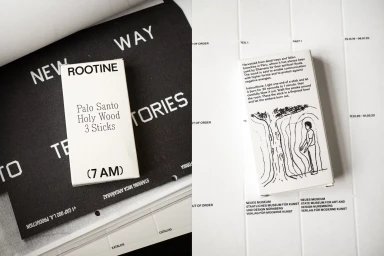
Rootine's brand identity, crafted by Daily Dialogue, centers on a minimalist aesthetic that spans packaging, motion graphics, and graphic design. The system utilizes a stark monochromatic palette and bold typographic hierarchy to frame the product range, which extends from juice beverages to CBD and wellness goods. The visual language leans into high-contrast compositions, combining clean serif typography with organic botanical illustrations and graphic UI elements. Whether applied to square-shaped glass juice bottles or matte-finished apothecary packaging, the design maintains consistency through strict layouts and rhythmic, time-based iconography that defines the brand's functional approach to daily wellness.
Horizontal, Commercial, Minimalist, Clean
Typography
Solid Colour
Advertising Campaign
