Logo
Curling corner of a printed white page revealing a large black number three and typographical guidelines.
Screenshot of Resident brand identity website interface showing a grid of video thumbnail previews
Man holding a black smartphone showing website navigation against a plain white background for Resident brand identity
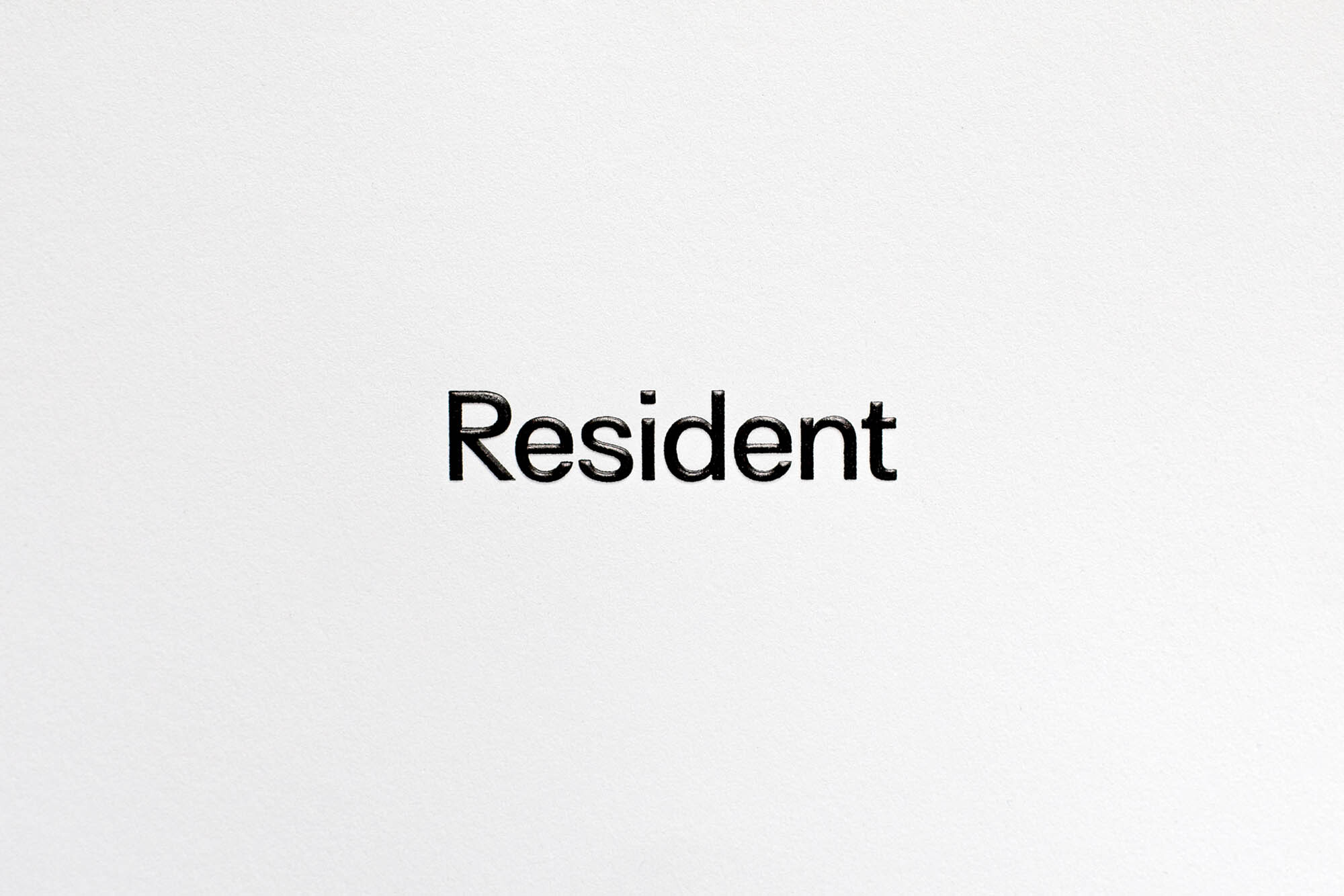
Black debossed typography spelling Resident centered on a white textured paper background
Minimalist corporate stationery design for Resident showing brand name, tagline, and contact info on white paper.
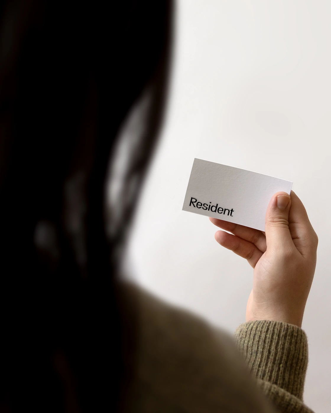
Close-up of a person holding a white business card featuring the Resident logo against a plain wall.
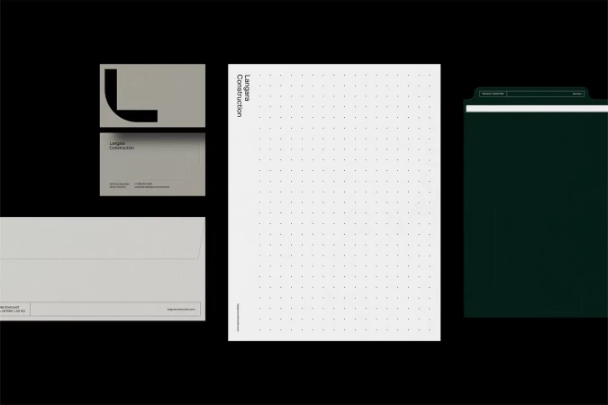
Minimalist stationery set featuring white letterhead and business cards with clean black Resident branding typography
Clean editorial page layout titled Neighbourhood with photography of people on The Yorkville Rock against a blurred backdrop.
Over-the-shoulder view of a person reading an open brand guidelines booklet featuring typography and graphic arrow icons.
Close-up of a printed brand identity guidelines document with a visible table of contents on textured white paper.
Curling corner of a printed white page revealing a large black number three and typographical guidelines.
Screenshot of Resident brand identity website interface showing a grid of video thumbnail previews
Man holding a black smartphone showing website navigation against a plain white background for Resident brand identity

Resident Brand Identity 2024

About

Vanderbrand leads the brand identity project for Resident, delivering a comprehensive corporate system defined by a minimalist aesthetic and strict typographic rigor. The project spans editorial print collateral, digital interface design, and stationery, all unified by a consistent application of clean sans-serif type, structured grids, and extensive use of negative space. The resulting visual language reflects a modern corporate presentation, balancing functional information architecture with deliberate, tactile print finishes. Techniques such as emboss and deboss are employed to introduce depth to the stationery, while editorial layouts leverage a Swiss-inspired typesetting style to frame content. The execution is captured under soft, natural lighting, emphasizing the physical quality of the paper stock and the precision of the graphic design elements.

Brand

Credits

Styles

Techniques

5000+ creatives to discover

Sign up to gain access to the entire directory. It’s free.

Visie is a curated library of creative professionals.
Trusted by