
Reloop: Brand Identity
Brand
Date
Sep 2022
Description
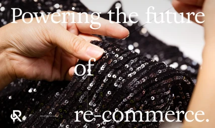
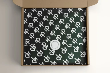
Reloop’s brand identity project centers on a clean, minimalist aesthetic that bridges digital motion graphics and tactile packaging design. The work, executed by Paper Stone Scissors, prioritizes fluid typographic form and a restrained colour palette, utilizing muted sage and deep forest greens to frame its visual identity. The project channels a modern, re-commerce focused narrative through kinetic typography and motion graphics. Elements transition between stark, high-contrast layouts and textured, rhythmic patterns, while print assets reinforce the brand's tactile nature through close-up editorial photography and disciplined packaging design.
Style
Horizontal, Commercial, Clean
Techniques
Motion Graphics
Color
Forest Green
Context
Brand Film / Corporate Video
Associated creatives
5000+ creatives to discover
Sign up to gain access to the entire directory. It’s free.
Visie is a curated library of creative professionals.