
Quagga: Brand Identity


Feb 2024
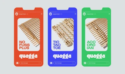
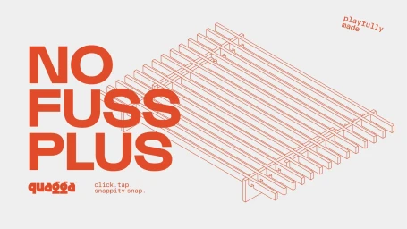
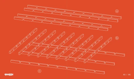
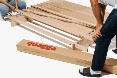
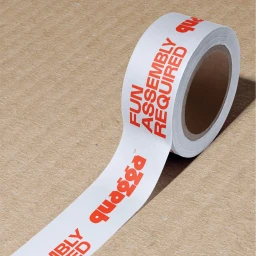
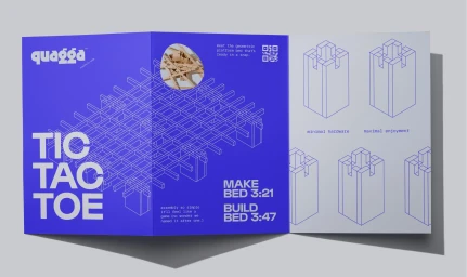
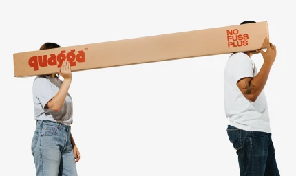
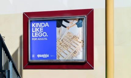
The brand identity for Quagga establishes a modular, minimalist visual system centered on the concept of simple, tool-free furniture assembly. Developed as a comprehensive identity project, the work leans into a bright, clean aesthetic that prioritizes functional graphics and isometric line art. The design program spans digital templates, brochures, and environmental signage, utilizing a bold palette of red, blue, and orange to accent the natural textures of wood and cardboard. Graphic design was led by newkid, with web development provided by B9 Digital. The visual identity is supported by photography from Louisa Nicolaou and production and prop styling by Abigail Ballanger, who together captured the interplay between the brand’s instructional schematics and its flat-pack product reality. The work employs a highly structured layout, integrating vector-based technical diagrams with modern typography.
Horizontal, Commercial, Clean
White Seamless


