
Howie: Brand Identity
Feb 2026
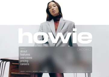
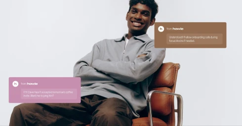
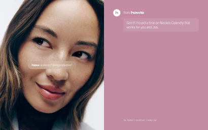
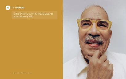
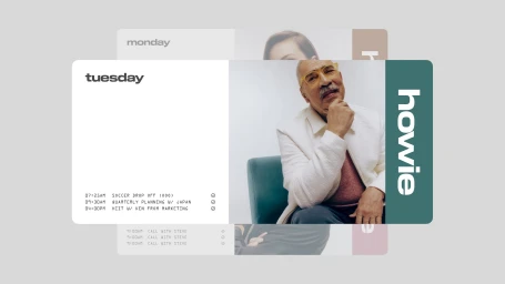
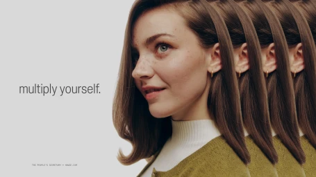
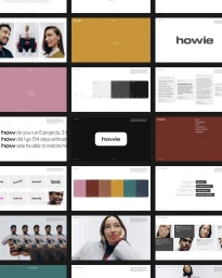
The brand identity for Howie masterfully bridges the gap between clinical efficiency and human-centric connection within the competitive apps and digital platforms landscape. Through a sophisticated visual language, the project leans into a clean, minimalist aesthetic that champions corporate clarity while maintaining an approachable, lifestyle-focused warmth. The design execution utilizes strategic UI illustration and bold, contemporary typography to transform complex software functionality into a relatable narrative. This is further elevated by the creative interplay between high-key portraiture and graphic color-blocking, creating a cohesive visual rhythm that feels both professional and dynamic. The project, underpinned by expert design from newkid and high-quality photography by Lian Benoit, successfully integrates diverse human subjects to anchor the brand's digital presence in reality. Complementing the static assets, motion elements directed by Parker Seaman and brought to life through Catherine Camiré's motion work add a layer of sophisticated visual effects that elevate the brand's fluidity. By blending studio strobe techniques with intentional graphic interventions, the identity avoids the cold, robotic tropes common in technology branding, favoring instead a layered, editorial approach. The result is a polished, versatile system that communicates the brand’s promise of productivity and digital ease, firmly positioning Howie as a modern leader in the technology sector through deliberate, high-impact design choices that resonate across multiple media channels.
Commercial, Clean, Vertical
White Seamless


