Puresport: Brand Identity





Jan 2023
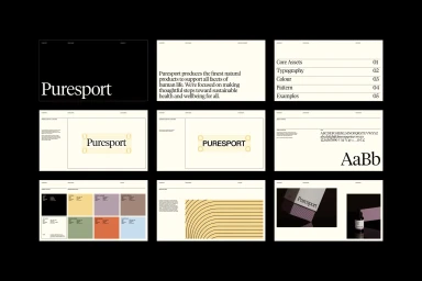
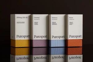
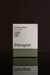
Puresport's brand identity centers on a minimalist design system that balances high-contrast typography with a distinctive geometric color palette. Developed with graphic design by Field of Play, the visual language utilizes clean serif type and structured grids to establish a cohesive aesthetic across product packaging and brand collateral. The identity is captured through a range of commercial assets, including macro product photography by Kirsty Dawn that employs low-key lighting to emphasize texture and reflection. Beyond the studio-focused identity work, the project includes documentary-style event imagery featuring branded running events, grounding the brand's graphic precision in the context of active outdoor sports.
Commercial, Clean, Minimalist
Black Seamless
E-commerce / Product