Nakatomi: Brand Identity



Nov 2022
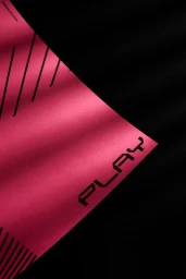
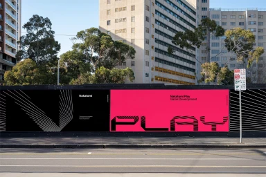
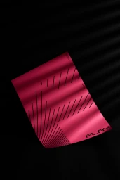
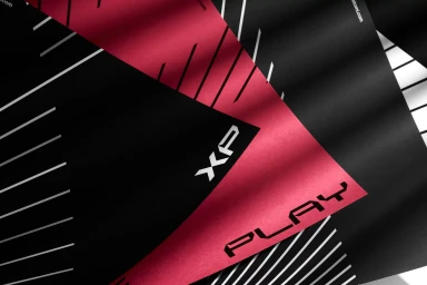
Nakatomi’s brand identity project establishes a visual language centered on structural precision and high-contrast minimalism. Developed by Field of Play, the system utilizes a striking palette of hot pink, black, and white to ground its bold geometric typography and linear motifs. The identity leans into a modular aesthetic, incorporating custom glyphs and recurring diagonal patterns that translate across both tactile print applications and large-scale environmental displays. Photography by Kirsty Dawn captures the interplay of these graphic elements, emphasizing the material quality of textured paper stocks and the scale of the system within urban transit hubs and outdoor advertising billboards. By pairing clean vector layouts with directional lighting, the project maintains a consistent architectural quality across its diverse touchpoints, from intimate poster compositions to expansive motion graphics.
Commercial, Horizontal, Clean
Typography