Prospect Brand Identity 2020
About
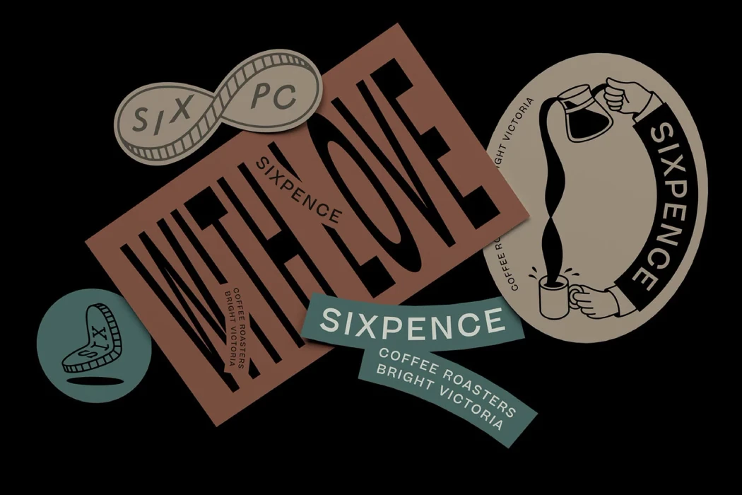
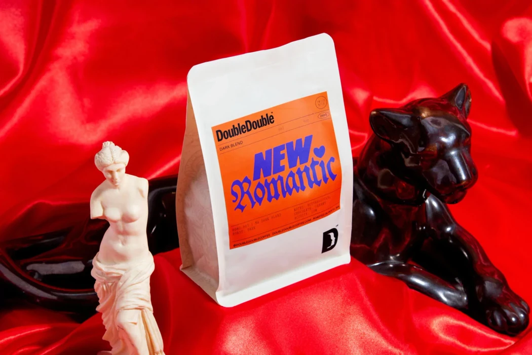
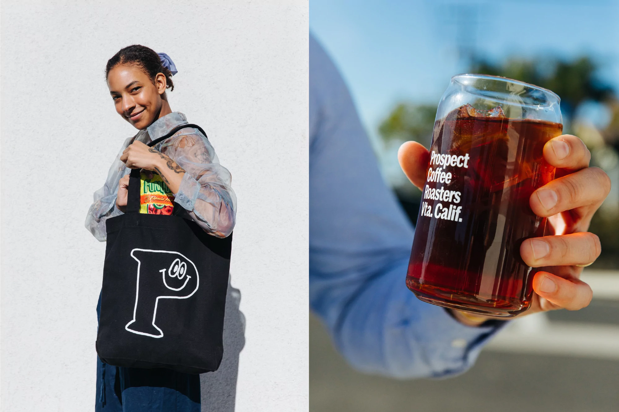
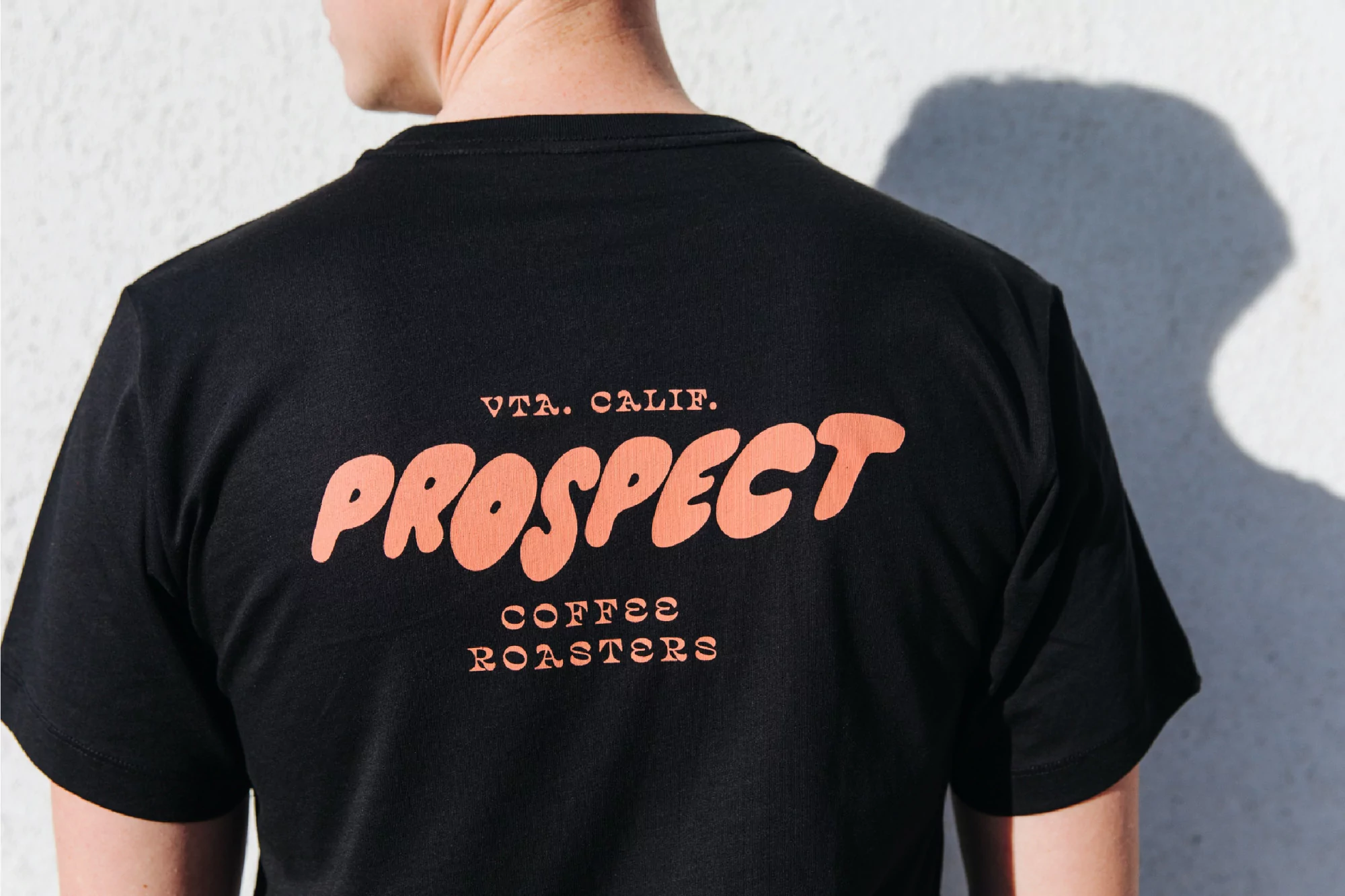
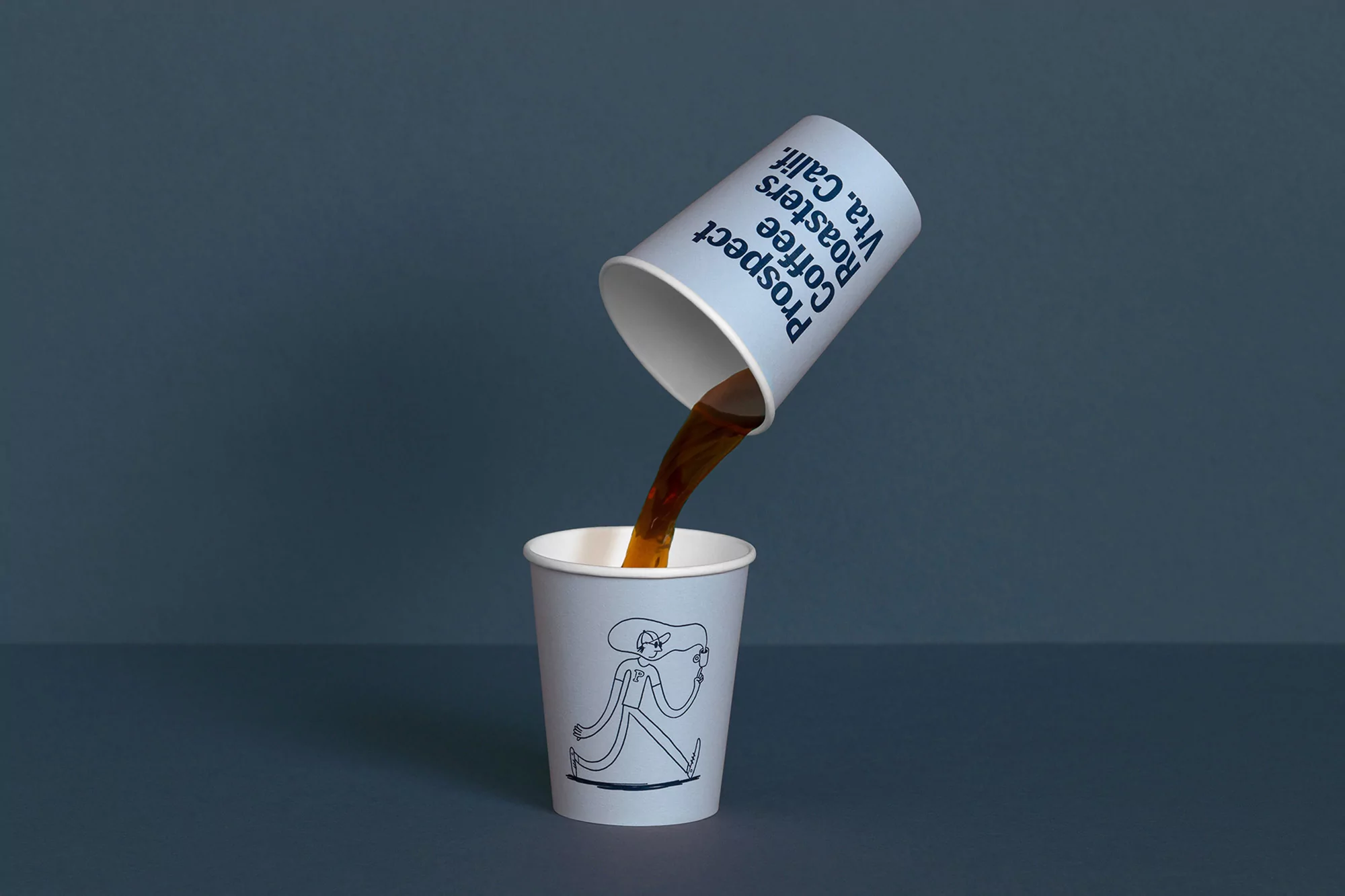
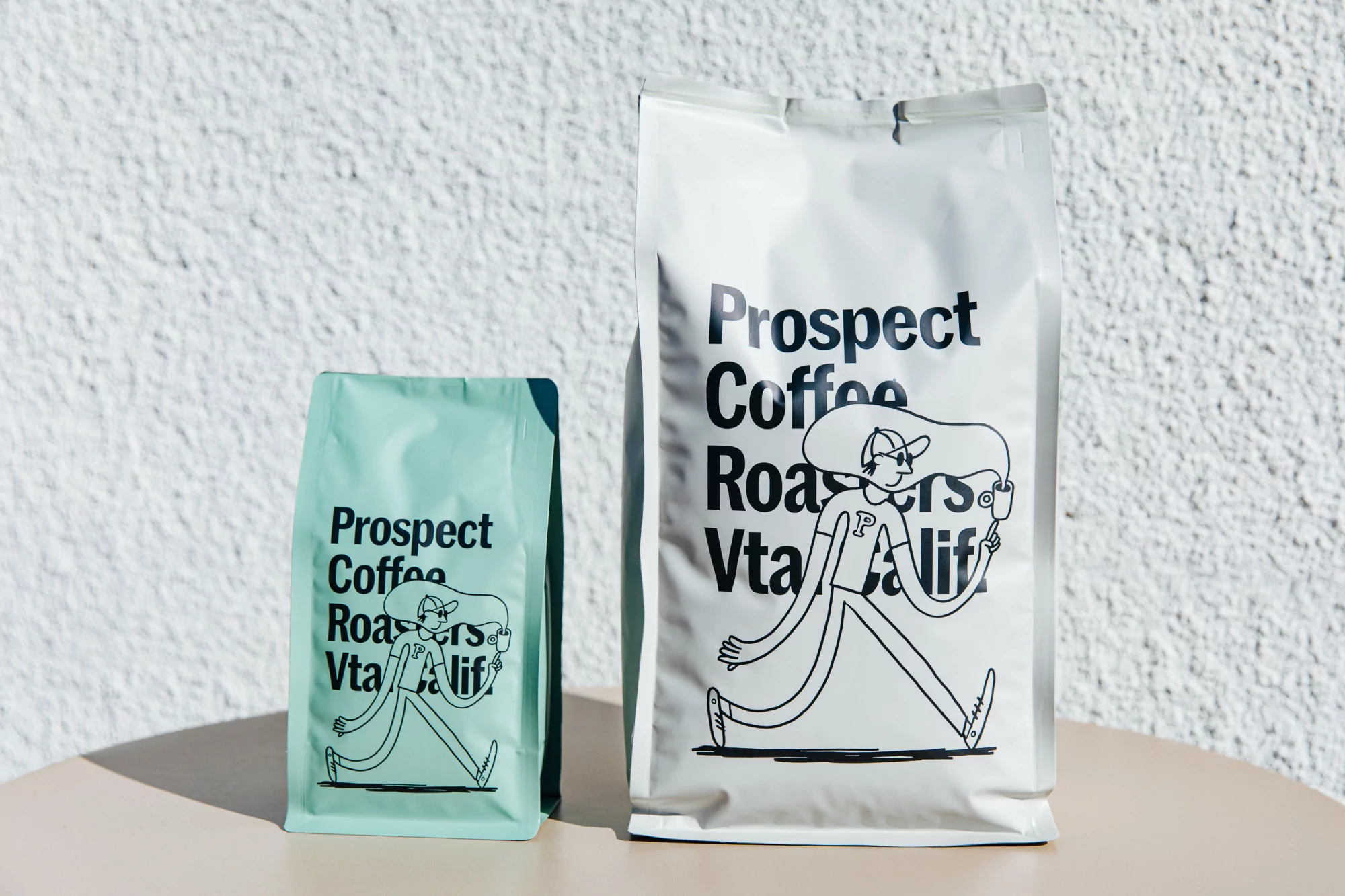
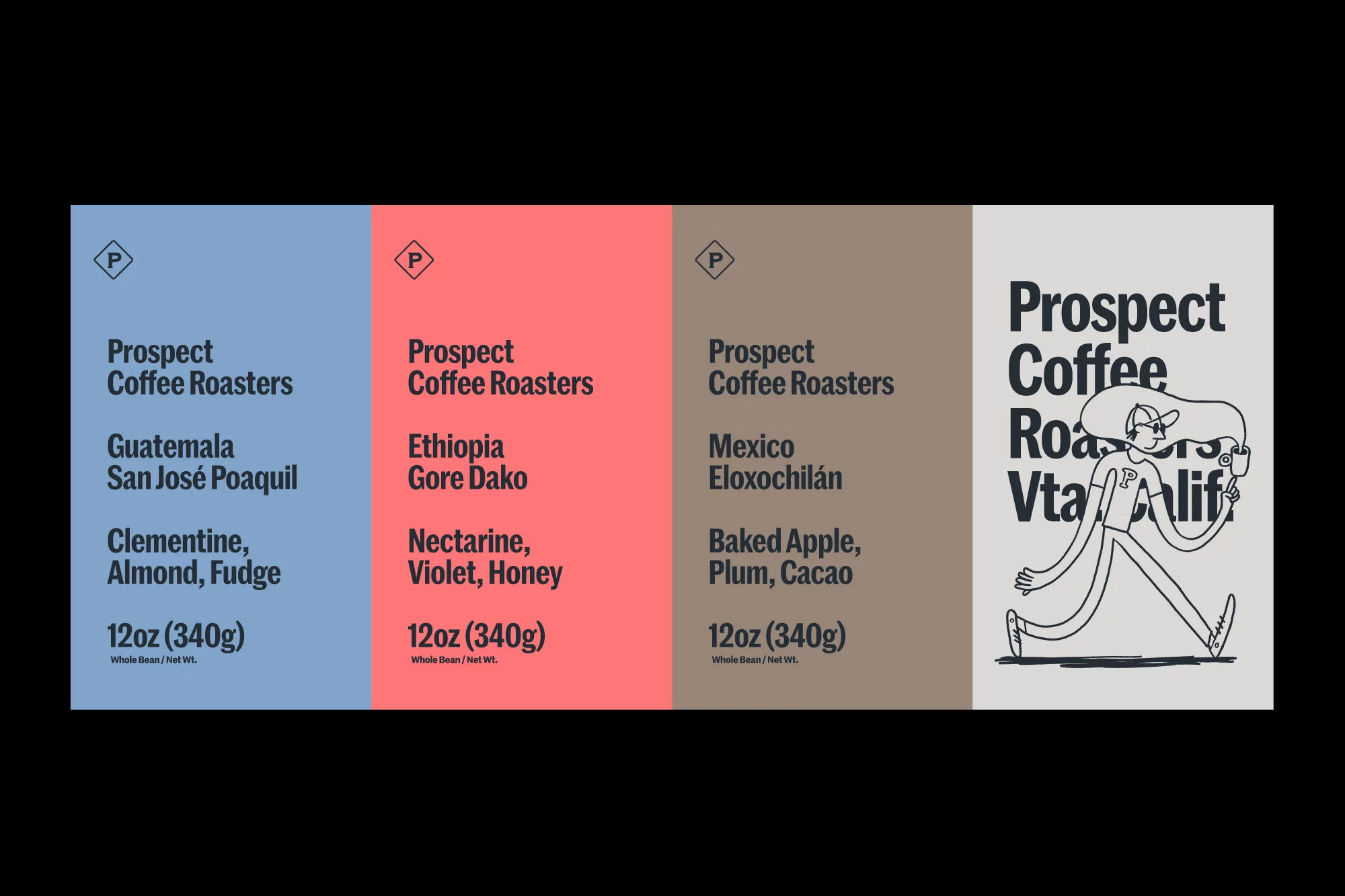
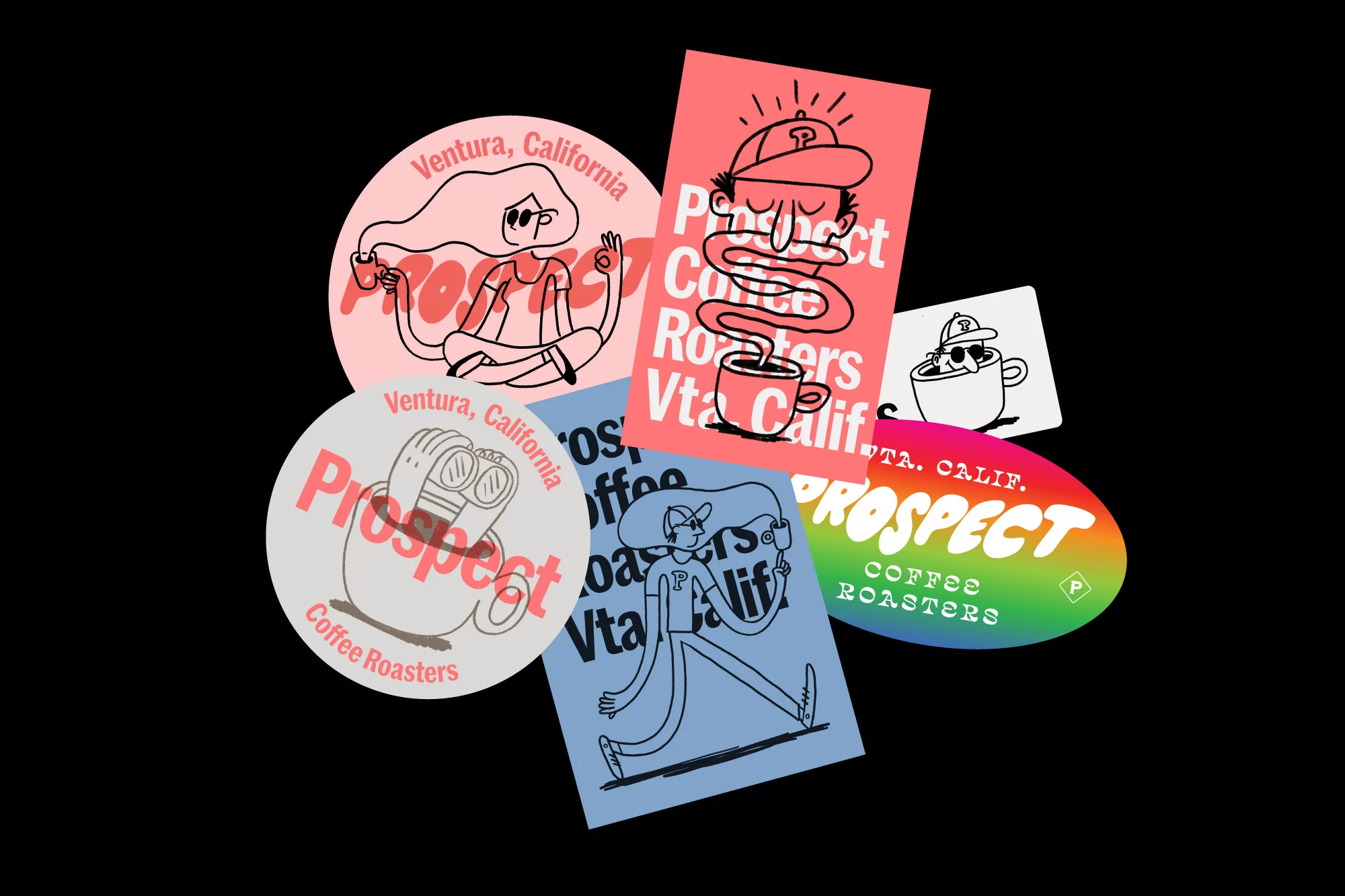
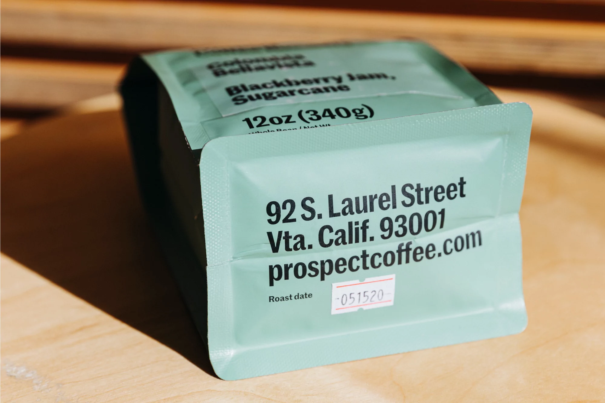
The brand identity for Prospect Coffee Roasters strikes a harmonious balance between youthful energy and clean, contemporary minimalism within the competitive CPG and packaged food sector. Developed with graphic design expertise from Alter, the project captures the essence of a modern coffee brand through a playful, illustrative language that feels both approachable and highly professional. By integrating whimsical line-art characters with bold, sans-serif typography, the visual system successfully translates across diverse touchpoints, from matte-finish retail packaging and apparel to vibrant, collectible stickers. The visual storytelling leans heavily into a bright, optimistic aesthetic, utilizing natural light to reinforce a daytime, sun-drenched lifestyle context typical of the Ventura, California origin. Whether through the crisp product packshots or the high-speed photography capturing the fluid pour of a fresh brew, the identity remains grounded in a consistent, graphic-forward strategy. The use of pastel color blocks and distinct, clean layouts creates a cohesive shelf presence that distinguishes the brand from more traditional roasters. By blending hard light for architectural, shadow-defined apparel shots with soft, even studio lighting for product documentation, the campaign ensures a versatile and polished presentation. This holistic approach to design reflects a thoughtful, modern sensibility that prioritizes clarity and character, effectively cementing Prospect as a brand that is as much about community and play as it is about the craft of coffee.