
Photoworks: Brand Identity


Jul 2020
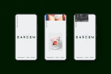
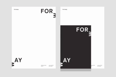
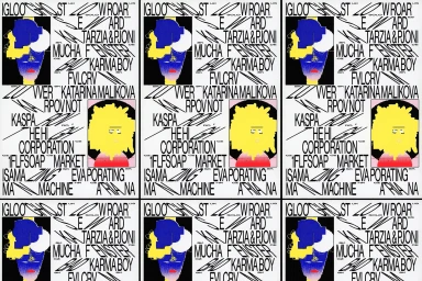
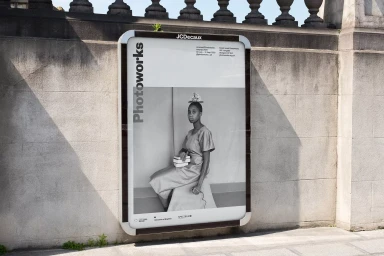
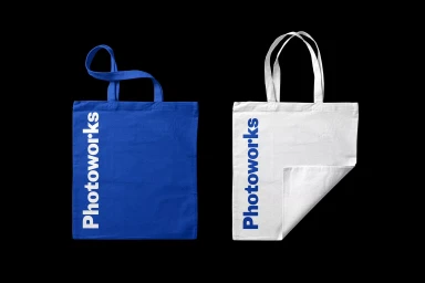
The brand identity project for Photoworks serves as a masterclass in modern, high-contrast visual communication, seamlessly spanning across digital interfaces, physical merchandise, and large-scale outdoor advertising. Executed with a precision that bridges corporate structure and artistic experimentation, the work leans into an aesthetic of editorial minimalism. The team, including collaborative contributions from The Click, Kallan & Co, Design by Toko, and Andrej & Andrej, has developed a cohesive design language defined by bold sans-serif typography and a rigorous use of negative space. Whether through the clean, studio-lit product shots employing beauty light techniques or the rhythmic, vector-based posters for Formway, the identity consistently favors a stark black-and-white palette that commands attention. The versatility of the system is further evidenced by its application in Helsinki-based digital interfaces and urban billboard displays, where live-action techniques blend with structured typography to create a premium, timeless feel. By balancing surrealist visual elements with highly readable, minimalist layouts, the project establishes a robust brand presence that feels both experimental and inherently professional. This identity project is a testament to how intelligent grid usage and intentional composition can elevate collateral from simple information delivery to a sophisticated, multisensory brand experience that resonates across diverse media formats and environmental contexts.
Commercial, Clean, Minimalist, Horizontal


