
White Rabbit Gallery: Brand Identity
Jul 2020
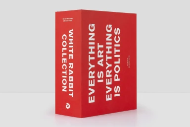
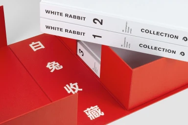
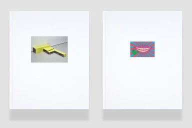
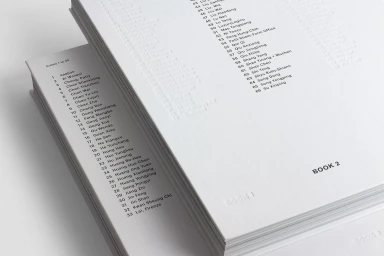
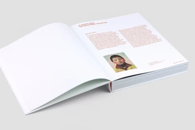
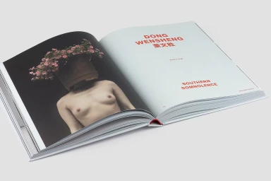
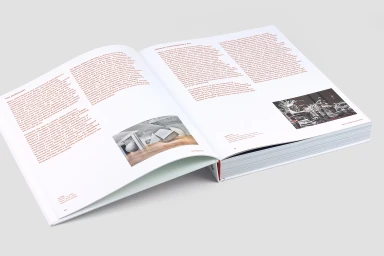
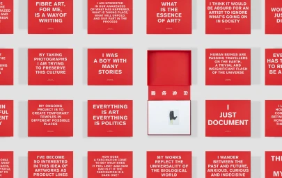
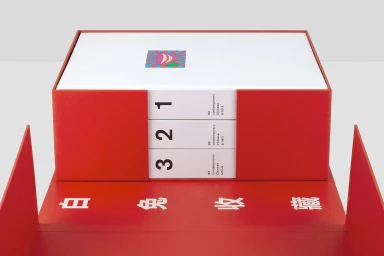
The brand identity for White Rabbit Gallery reflects a sophisticated marriage of institutional gravitas and contemporary artistic playfulness. Conceptualized through a meticulous editorial design process, the visual system leans into a high-key, minimalist aesthetic that allows the curated selection of contemporary Chinese art to take center stage. By utilizing a bold color palette defined by deep, saturated reds and stark white negative space, the identity establishes a clear, hierarchical typographic system that feels both modern and permanent. The tangible quality of the project is evident in the bespoke packaging solutions, featuring structured clamshell boxes and embossed book spines that transform collection documentation into a tactile, gallery-grade experience. Through a collaborative effort involving Design by Toko for graphic design, expert photography by David Roche, and specialized print production by Wilco Art Books on high-quality paper provided by MultiDesign, the identity successfully balances rigorous corporate documentation with surreal, pop-infused visual elements. Techniques such as emboss and deboss add depth to the materials, while the integration of vector graphics and editorial layouts ensures a cohesive, professional narrative across the entire suite. This branding effort captures the intellectual nature of the gallery, utilizing consistent typographic hierarchies and intentional composition to define White Rabbit as a premier authority within the global contemporary art discourse, perfectly bridging the gap between archival history and vibrant, live-action artistic expression.
Horizontal, Commercial, Clean, Minimalist
Typography
White Seamless


