
Energy Manifest: Brand Identity



Jul 2020
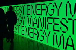
For the Energy Manifest conference, the collaborative design efforts of Andrej & Andrej and khn office have birthed a brand identity that masterfully bridges the gap between high-tech electromobility and traditional architectural space. At the heart of this visual language lies a stark, minimalist aesthetic defined by an intense neon green and black color palette, which serves as a recurring motif across diverse touchpoints. The identity relies on a bold, geometric typographic hierarchy that effectively anchors the brand, whether applied to functional identification badges, massive digital screens, or vertical street banners placed against the historic backdrop of Bratislava’s Old Market Hall. The design team successfully navigates the complex requirements of an industry-focused event by utilizing vibrant color blocking to ensure clarity while maintaining a sophisticated, modern edge. The use of cinematic lighting and clean UI illustration elements creates a cohesive narrative, transforming the event’s environmental graphics into a striking reflection of modern energy storage solutions. By juxtaposing the sharp, digital-first aesthetic of the typography against natural light and architectural surroundings, the brand identity creates a rhythm that feels both grounded and forward-thinking. This project stands as a testament to the power of systemic graphic design, where consistent application across print, digital, and physical environments fosters a sense of professional authority and innovation that resonates throughout the entire conference experience.
Horizontal, Commercial
Typography

