
Pasierbek: Brand Identity
Aug 2018
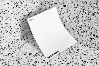
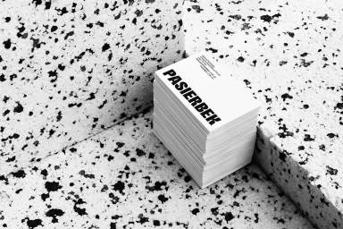
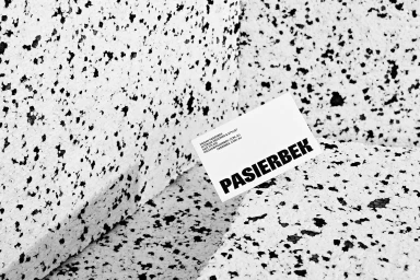
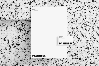
The brand identity for Pasierbek operates at the intersection of commercial precision and stark graphic minimalism, establishing a visual language that feels both authoritative and approachable. Through a series of carefully curated compositions, the project leverages a high-contrast, monochrome palette to emphasize the raw materiality of its corporate collateral. By placing crisp white stationery and bold business cards against the coarse, tactile surfaces of speckled stone and porous polystyrene foam, the design effectively creates a sense of depth that elevates standard office assets into high-end objects. This interplay between smooth paper textures and gritty industrial backdrops serves to anchor the brand's typographic identity, which relies on a clean, sans-serif aesthetic to convey a sense of modern professionalism. Whether through macro photography that draws attention to the structural weight of a stacked card or wide-angle shots that utilize hard light to cast sharp, geometric shadows, the execution leans into a clinical, cinematic presentation style. The overall result is a cohesive brand identity that feels highly considered, using typography not just as a means of communication, but as a central design element. With the expert graphic design input from Both, the project demonstrates how deliberate spatial arrangement and material contrast can define a corporate narrative, offering a masterclass in clean, minimalist branding that prioritizes clarity, structural integrity, and long-lasting visual impact.
Horizontal, Commercial, Monochrome, Clean, Minimalist
Typography
Website / Web
