
Park Lane hotel: Brand Identity


Jan 2022
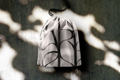
Mother Design delivers a comprehensive brand identity for the Park Lane hotel, anchoring the visual system in a fusion of bespoke typography and tactile, organic textures. The project spans diverse physical collateral and digital touchpoints, from custom drawstring pouches and stationery to large-scale construction hoarding and web interface design. The visual language leverages a clean, minimalist approach that contrasts bold serif and sans-serif lettering against a backdrop of moss, flora, and muted vintage textures. By integrating abstract botanical illustrations and arched structural motifs, the design identity evokes a pastoral, atmospheric quality that bridges the gap between urban hospitality and the natural environment.
Commercial, Clean, Minimalist
Typography
Advertising Campaign
