
BrandPark Lane hotel
ProjectBrand Identity
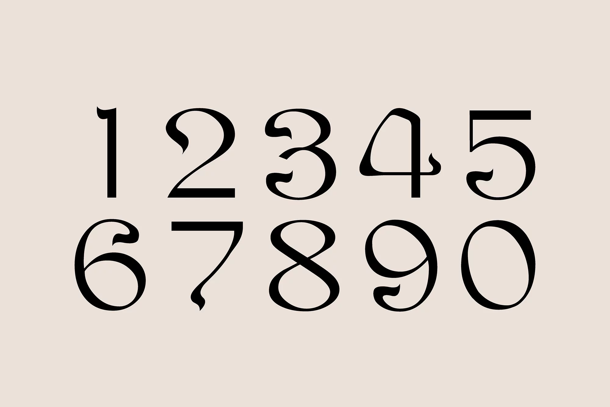
Park Lane hotel Brand Identity 2022
Associated creatives

Tags
Description
This graphic design piece presents a custom set of serif numerals from one through zero, rendered in clean black ink against a solid neutral beige background. The typography features distinctive stylistic flourishes and variable stroke weights across the numbers 1 through 9 and 0. Created by Mother Design as part of the brand identity project for the Park Lane Hotel, the composition highlights bespoke lettering and editorial precision. The minimalist layout focuses entirely on the form and proportions of the custom numerical characters.
Style
Commercial, Square, Clean, Graphic
Techniques
Typography, Vector
Color
Jet Black (30%)
Background
Solid Colour
Context
Advertising Campaign