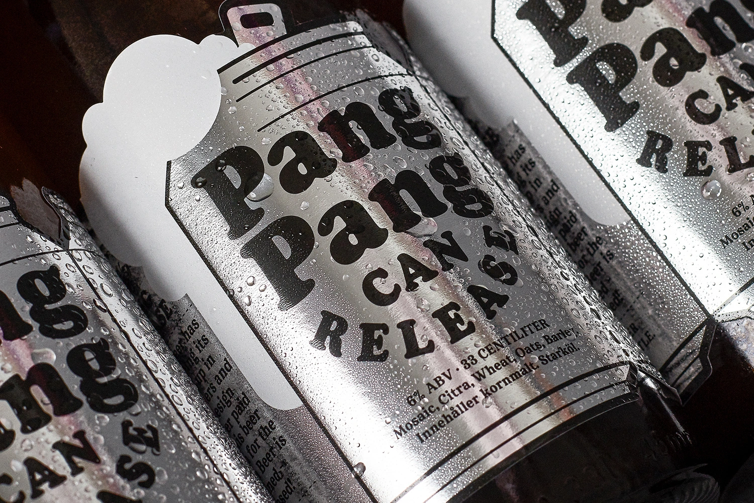
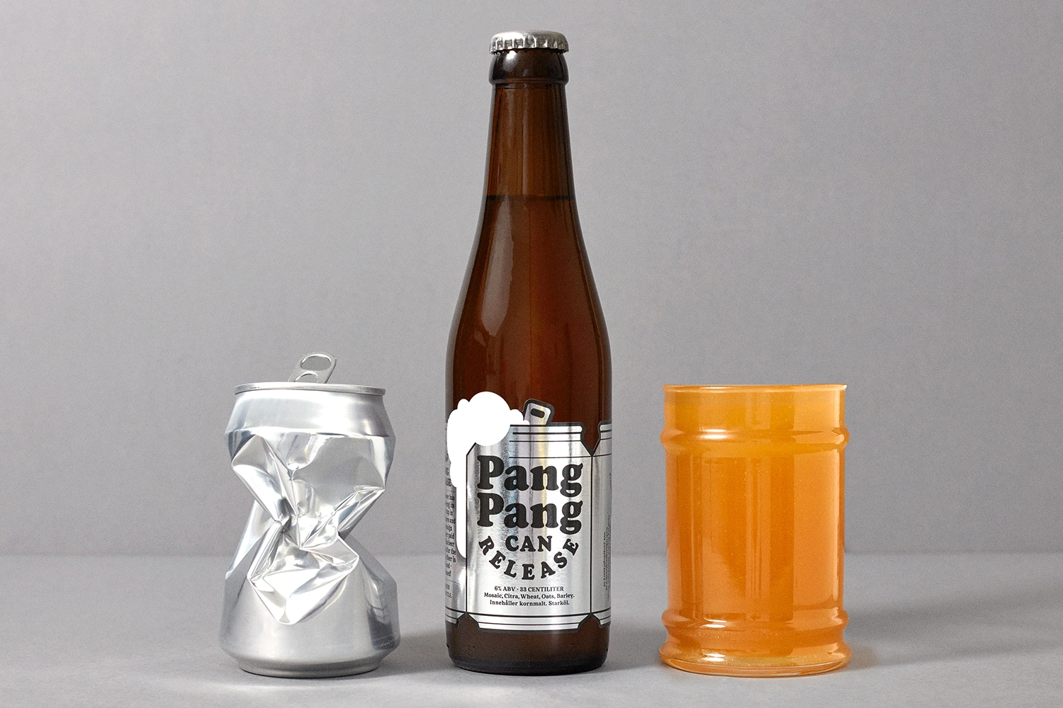
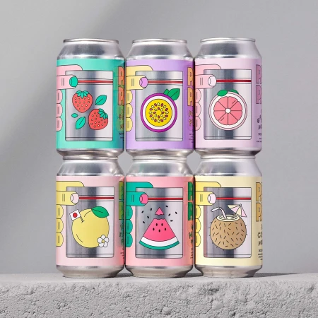
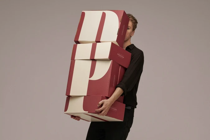
The brand identity for PangPang Brewery masterfully balances the grit of a working production facility with the refined precision of contemporary packaging design. Within the alcoholic beverages sector, this project establishes a distinct visual language that leans into an industrial aesthetic while maintaining a high degree of commercial accessibility. Through the lens of a documentary lifestyle approach, the brewery environment is captured with crisp natural light, grounding the brand in its authentic, functional roots. This raw, tactile energy is then carefully translated into a series of product-focused assets that utilize studio strobe lighting to emphasize clean lines and bold typography. Jens Nilsson spearheaded the graphic design, crafting a cohesive system where the metallic surfaces of silver labels and bottle caps become central to the brand’s identity. The use of repetitive composition and macro photography highlights a modern, minimalist sensibility that resonates through every element, from the condensation-dusted cans to the perfectly aligned bottles. By juxtaposing the physical reality of brewing with the sharp, graphic clarity of its labeling, the project successfully captures the essence of a modern craft manufacturer. The result is a sophisticated yet grounded brand identity that feels both established and refreshingly tactile, effectively communicating technical quality through consistent visual storytelling that respects the heritage of the product while embracing a modern market presence.