
Maldini Studios
Brand Identity
Jan 2017
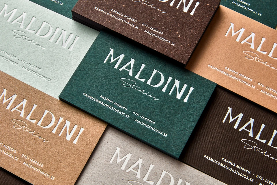
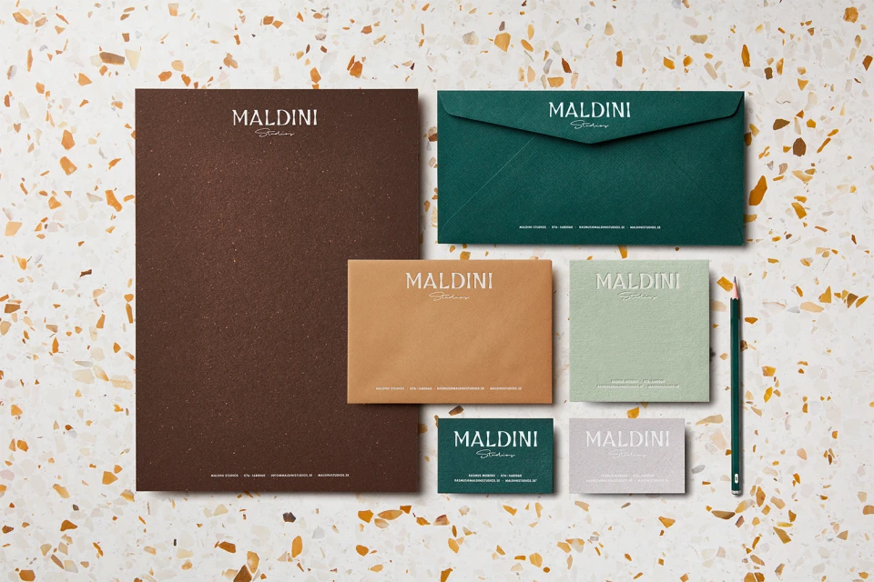
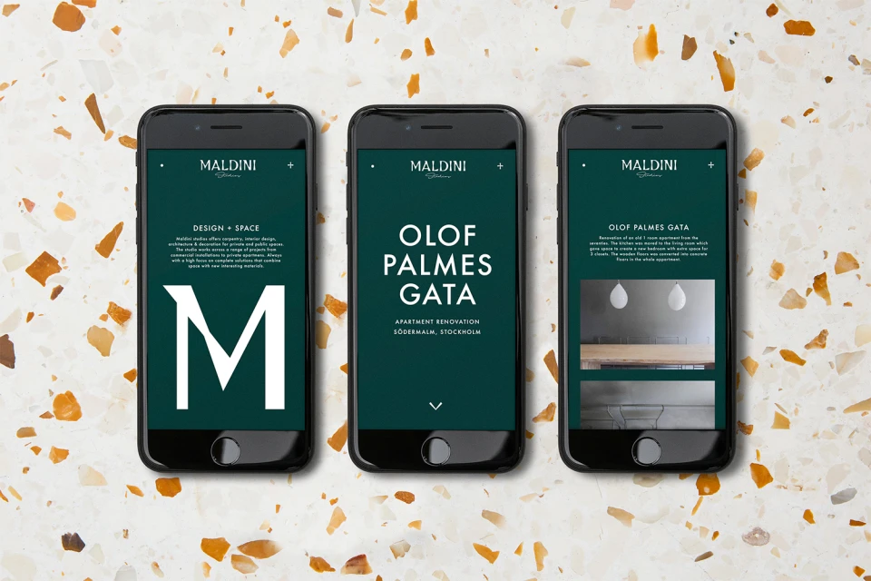
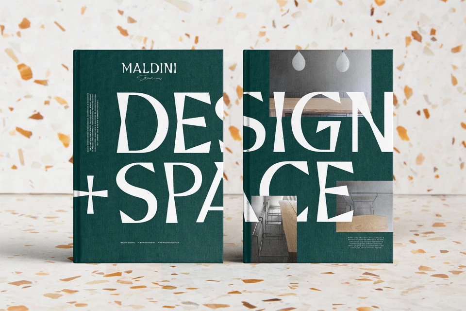
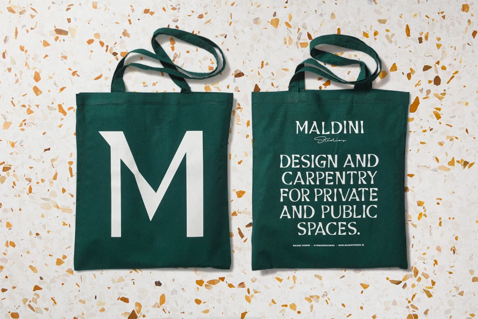
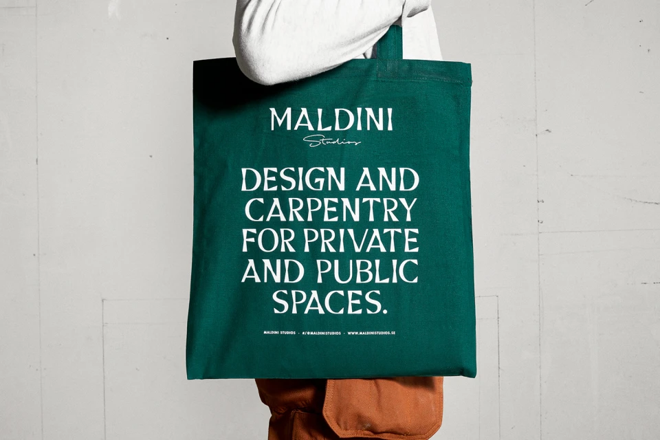
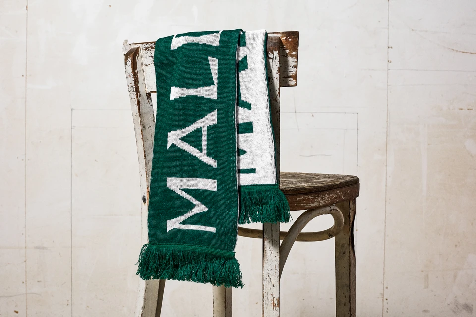
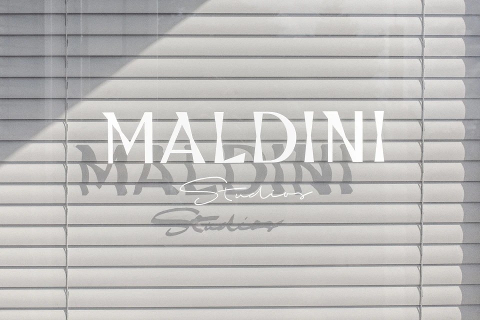
Maldini Studios has unveiled a cohesive brand identity that masterfully bridges the gap between sophisticated graphic design and tactile, artisanal craftsmanship. This comprehensive visual language, steered by the design expertise of Jens Nilsson, leans into a refined color palette of deep forest green, warm tan, and pale sage to establish a sense of timeless elegance. Across the suite, which encompasses everything from corporate stationery and bespoke knitwear to digital UI illustrations, the identity relies on a sharp, minimalist aesthetic. By pairing elegant serif typography with fluid, handwritten script, the studio achieves a balanced hierarchy that feels both human and highly professional. The project showcases a deliberate focus on material quality, utilizing natural light and macro photography to emphasize the rich textures of matte canvas, fabric-bound books, and premium paper stocks against neutral, speckled terrazzo backgrounds. Throughout the collateral, the interplay between structure and soft geometry creates a cohesive brand experience that feels polished and intentional. Whether rendered on a screen or a physical tote bag, the Maldini Studios mark remains a focal point of high-end corporate identity. This is a study in editorial minimalism, where the restraint of the layout—often punctuated by intentional shadow or stark, high-contrast typography—speaks volumes about the studio’s commitment to design and carpentry for private and public spaces.
Horizontal, Commercial, Minimalist, Clean
Typography
