
PangPang: Brand Identity
Jun 2019
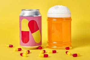
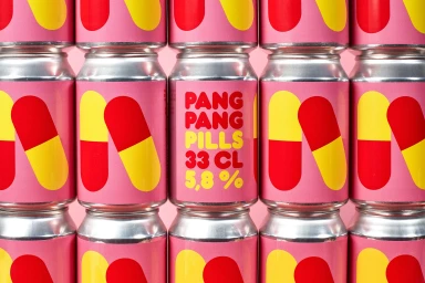
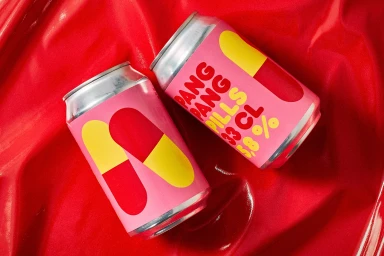
The brand identity for PangPang marks a departure from conventional beverage design, leaning into a bold and irreverent aesthetic that turns product packaging into a statement piece. Central to this project is a high-contrast visual language that draws heavily from pop art sensibilities, using a primary color palette of vibrant red, yellow, and matte pink to command immediate attention. Through a series of commercial photography assets, the identity utilizes clean typography and stylized capsule graphics to create a playful, medical-adjacent motif that feels both disruptive and meticulously considered. The execution highlights the versatility of the brand's visual identity, shifting effortlessly from minimalist, symmetrical grids to more tactile, high-shine compositions set against glossy, wrinkled surfaces. Jens Nilsson demonstrates a sophisticated command of graphic design here, ensuring that every element—from the rounded, approachable typeface to the deliberate pill iconography—functions in perfect harmony. By embracing a bright, lifestyle-focused narrative, the project transcends simple product placement, instead crafting a cohesive visual universe that feels intentional and tactile. The use of soft light and balanced studio compositions reinforces the premium quality of the aluminum packaging while keeping the energy distinctly youthful and punchy. This branding exercise successfully translates a quirky conceptual premise into a sharp, shelf-ready identity that feels as much like an art object as a consumer good.
Commercial, Horizontal, Graphic
Solid Colour
E-commerce / Product
