
Pana Chocolate
Brand Identity
Jan 2018
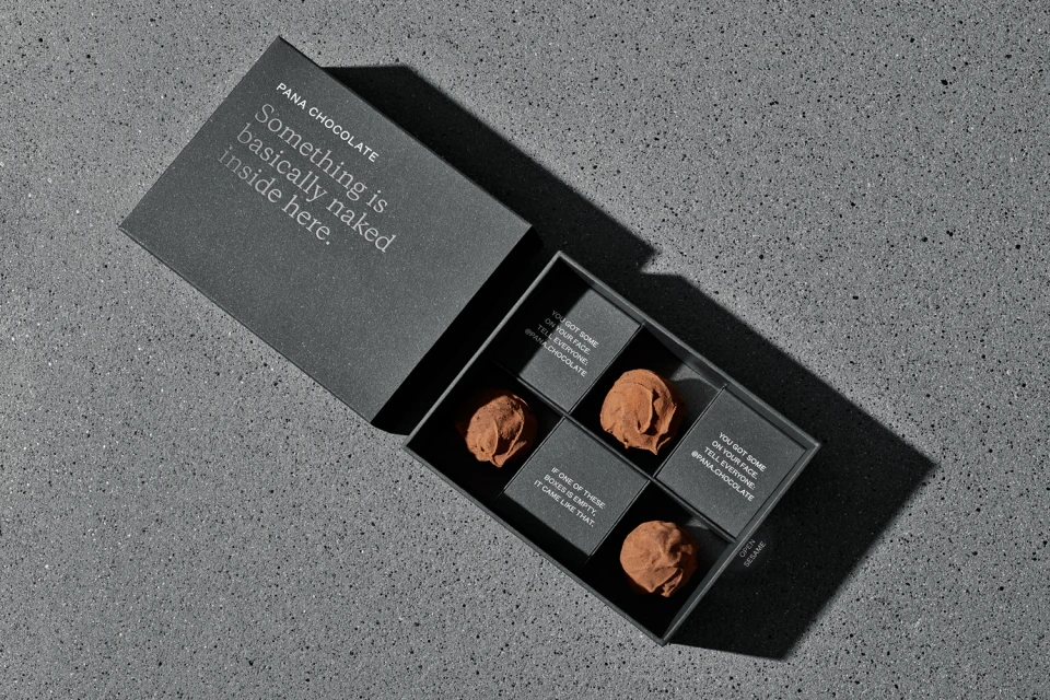
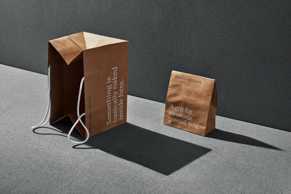
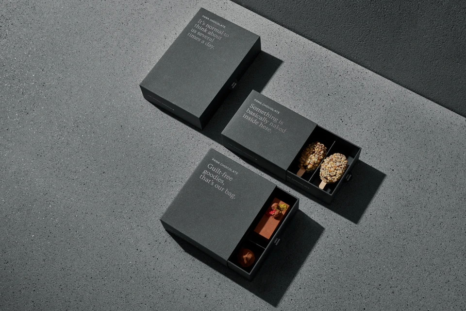
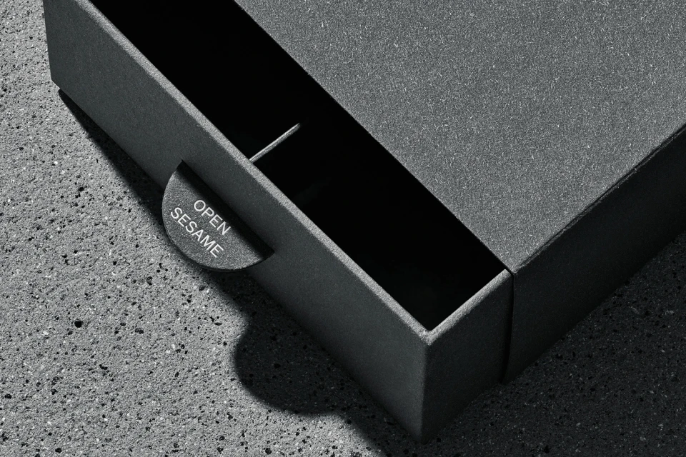
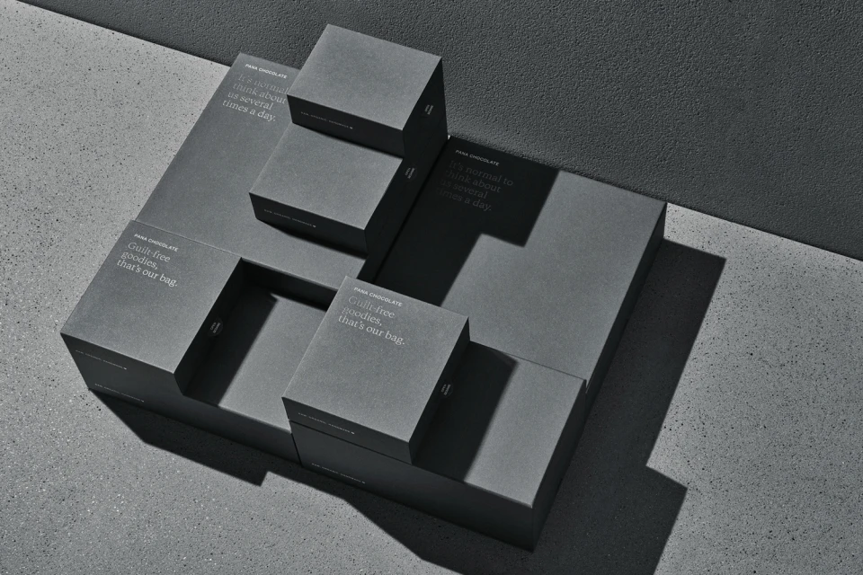
The refined brand identity for Pana Chocolate elevates the CPG landscape through a masterclass in minimalist packaging design. By anchoring the visual experience in an architectural, monochromatic palette of charcoal grey and white, the project eschews typical confectionery tropes in favor of a sophisticated, tactile aesthetic. The work, executed with graphic design prowess by The Company You Keep, leans into a clean, modern language that is both premium and undeniably witty. Across a series of commercial studio strobe images, the packaging takes center stage, utilizing crisp, directional lighting to cast sharp shadows against coarse concrete surfaces. This deliberate juxtaposition between the smooth, matte finish of the sliding boxes and the grainy, raw texture of the environment emphasizes the artisanal quality of the food and beverage offerings. The design is punctuated by playful, sans-serif typography that invites consumer engagement through irreverent brand messaging. Whether showcasing the tiered geometric arrangements of gift boxes or the humble, earth-toned paper bags, the project maintains a precise, consistent visual rhythm. By focusing on high-end materials and structural integrity, this campaign successfully positions Pana Chocolate as a refined choice for the discerning modern palate, proving that quiet, editorial minimalism can communicate a brand's value proposition far more effectively than traditional, cluttered visual marketing techniques.
Horizontal, Commercial, Clean, Minimalist
Hard Light
CPG / Packaged Food
Concrete Texture
E-commerce / Product
