
The Everleigh
Brand Identity
Nov 2017
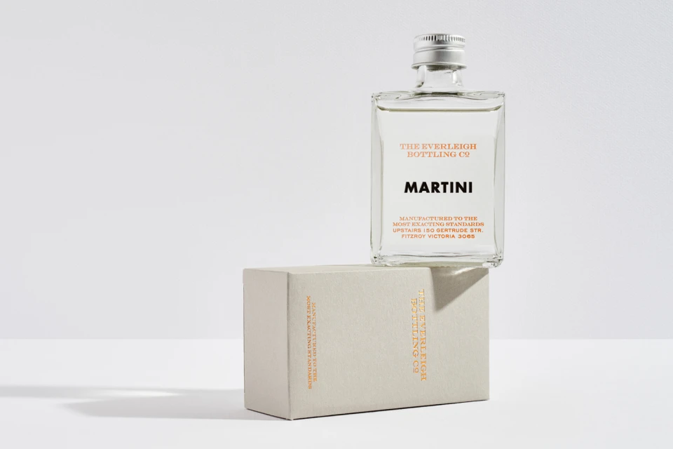
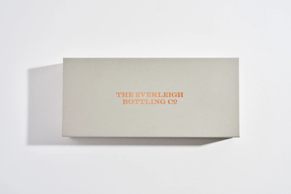
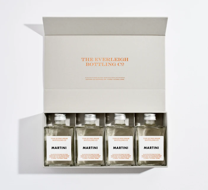
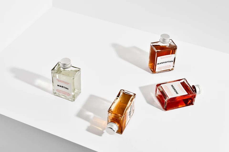
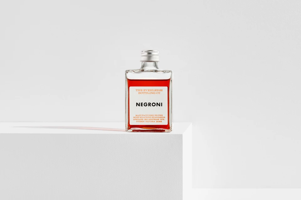
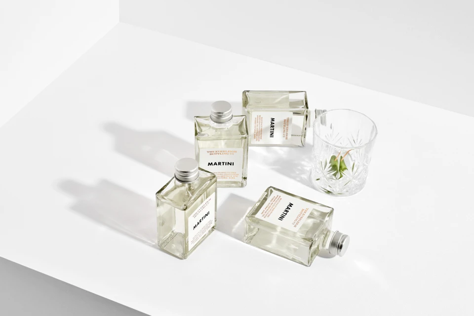
In the competitive landscape of the premium alcoholic beverages sector, The Everleigh Bottling Co. has unveiled a new brand identity that leans into a sophisticated, editorial minimalism. This project encapsulates the essence of high-end, artisanal cocktail craftsmanship, prioritizing clarity and structural elegance over unnecessary ornamentation. Through a series of meticulous product photography sessions, the campaign establishes a visual language defined by stark, high-key lighting and a neutral, considered color palette. By utilizing studio strobe techniques, the execution ensures that every facet of the packaging—from the tactile matte finish of the gift boxes to the precision of the copper foil embossing—is rendered with absolute clinical accuracy. The creative direction, spearheaded by The Company You Keep, focuses on the intersection of geometric precision and liquid storytelling, where the deep amber and red hues of the cocktails serve as the primary focus against a seamless white backdrop. This commercial work effectively elevates the humble bottled cocktail into an object of desire, emphasizing the brand's commitment to quality through clean typography and balanced, symmetrical compositions. The deliberate use of sharp, crisp shadows adds a layer of depth and physical presence to the imagery, grounding the products in a sterile yet welcoming aesthetic that speaks directly to the discerning modern consumer of fine spirits.
Horizontal, Commercial, Clean, Minimalist
Alcoholic Beverages
White Seamless
E-commerce / Product
