
Cushla Whiting
Brand Identity
Mar 2016
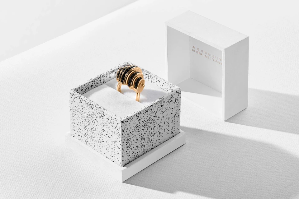
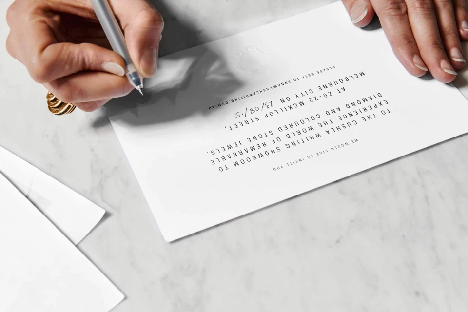
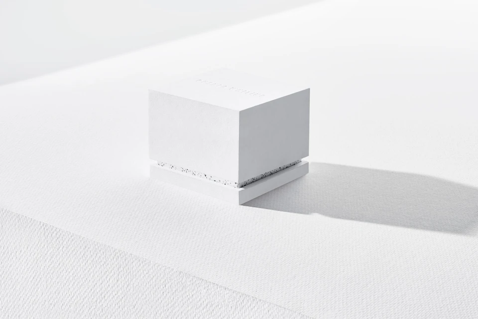
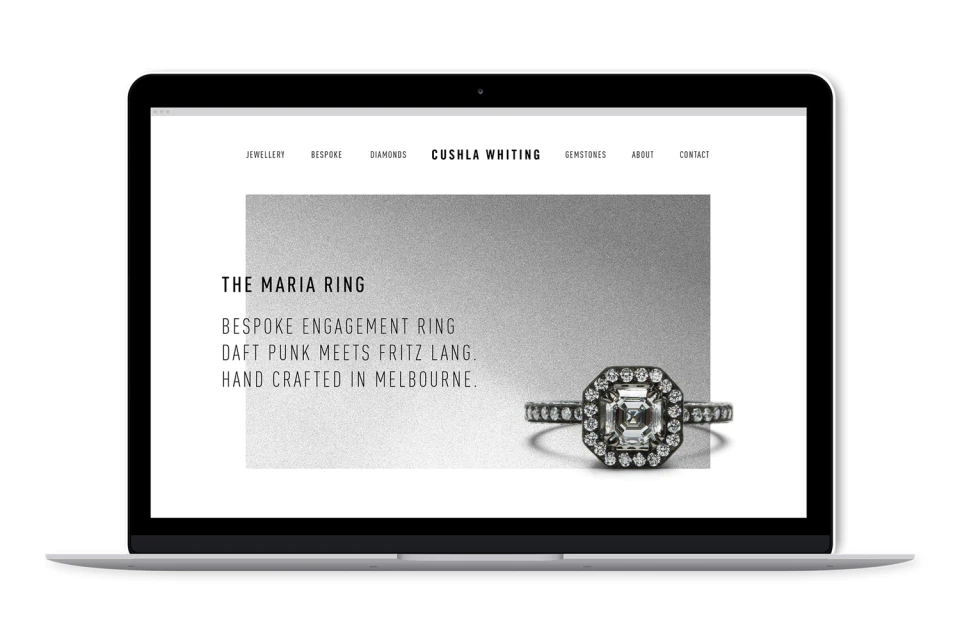
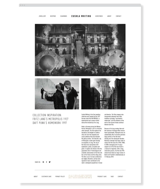
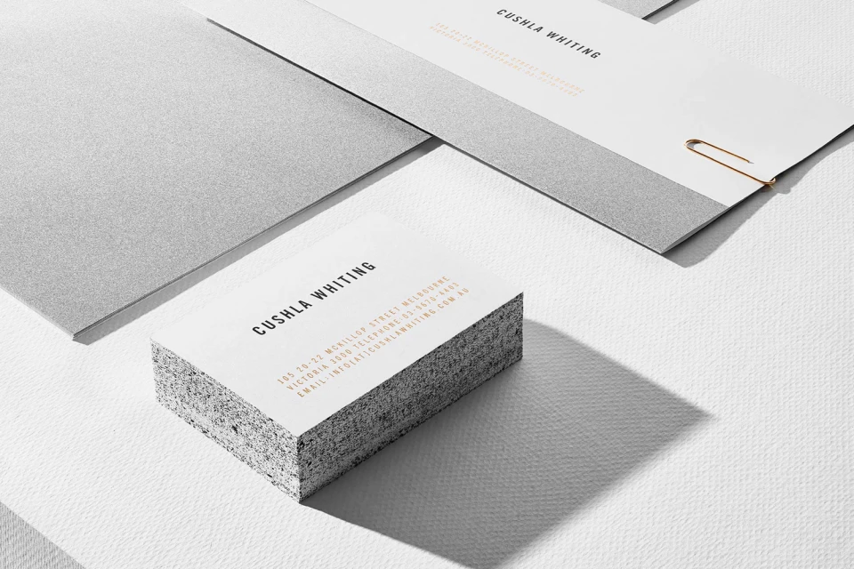
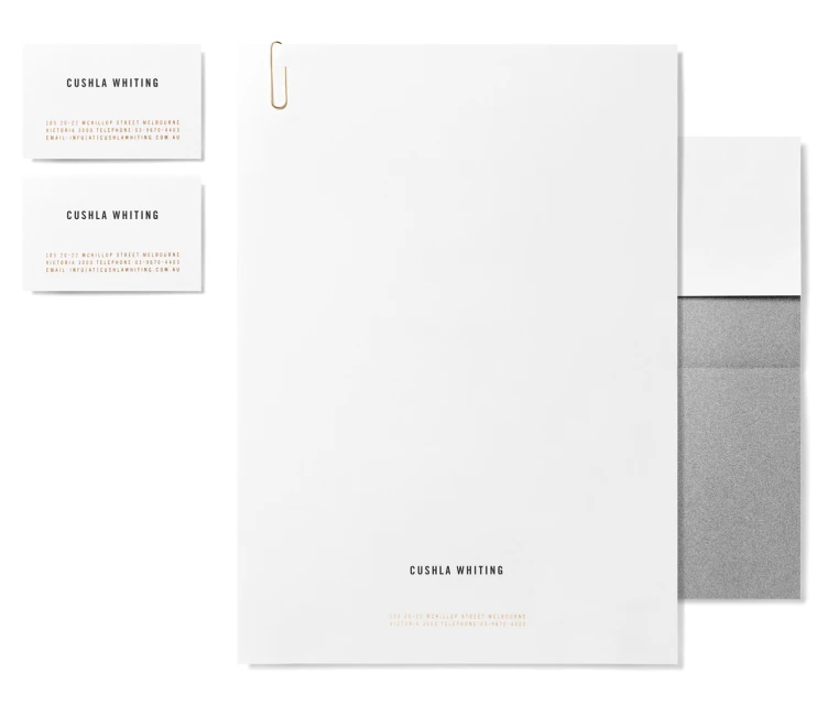
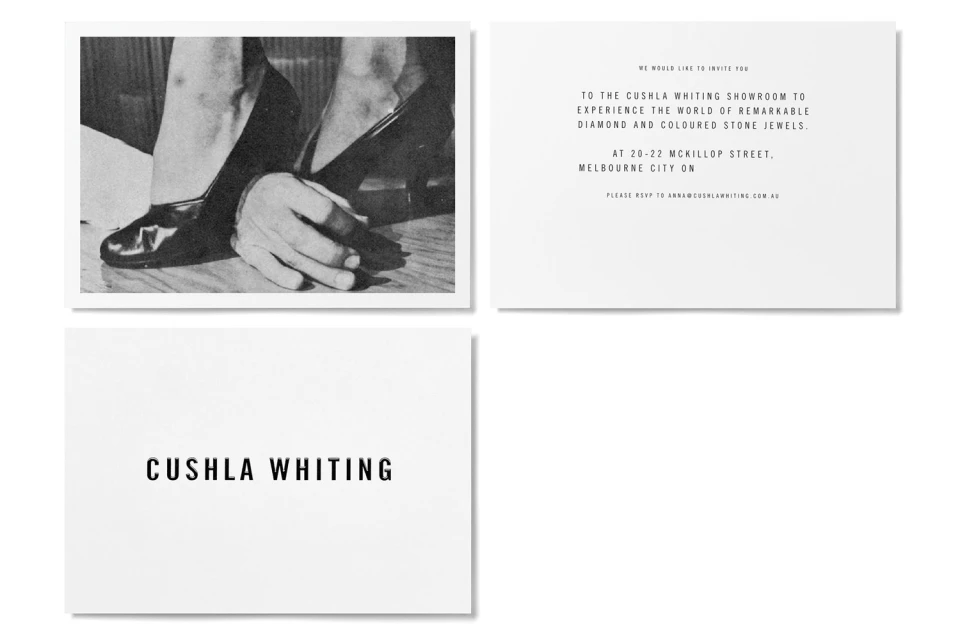
The brand identity for Cushla Whiting serves as a masterclass in editorial minimalism, grounding the bespoke jewellery house in a visual language that is as precise as the pieces themselves. Under the expert graphic design guidance of The Company You Keep, the project eschews unnecessary ornamentation in favor of a stark, architectural aesthetic. The identity relies on high-key lighting and balanced negative space to elevate everyday corporate collateral—from stationery and business cards to digital interface layouts—into tactile, luxury experiences. By utilizing natural light to cast deliberate, sharp shadows across textured surfaces, the imagery emphasizes the geometric precision of the jewellery. The brand leans into a monochrome palette, incorporating conceptual references to 1927 cinematic history and modern musical iconography to frame the company’s design philosophy. This professional consistency extends across every touchpoint, whether through macro product photography or the clean, sans-serif typography that defines their showroom invitations and web presence. The overall result is a cohesive, sophisticated system that feels inherently refined. By synthesizing these elements, the identity communicates an uncompromising attention to detail, positioning the label at the intersection of timeless elegance and contemporary corporate design. The use of studio strobe techniques further sharpens the brand's identity, ensuring that the interplay of grain, marble textures, and bold typography remains the primary narrative, effectively translating the prestige of fine jewellery into a visual identity that is both intentional and enduring.
Horizontal, Commercial, Clean, Minimalist
Typography
Jewellery
White Seamless
