
Pan After: Brand Identity

Dec 2019
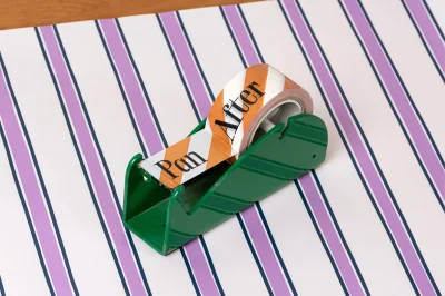
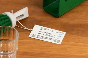
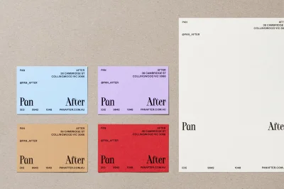
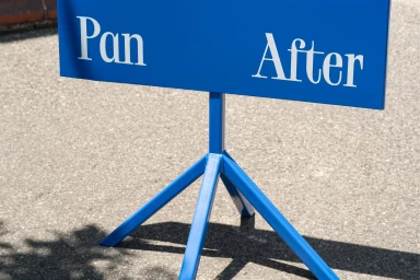
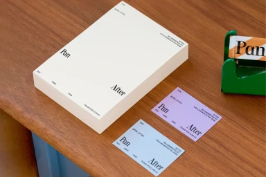
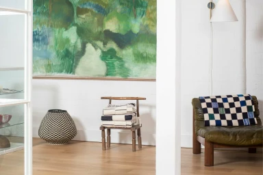
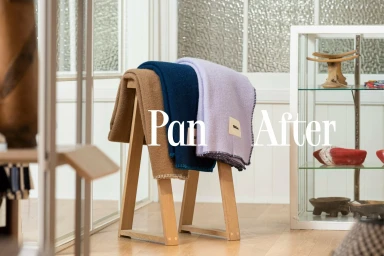
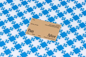
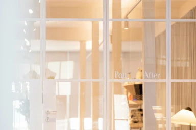
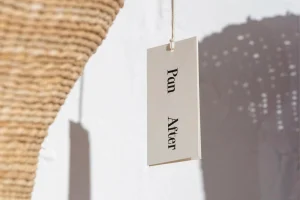
The brand identity for Pan After serves as a masterclass in retail visual storytelling, masterfully bridging the gap between utilitarian specialty retail and curated lifestyle design. With graphic design handled by Never Now, the project leans into a clean, editorial minimalism that celebrates the tactile nature of artisan goods. The aesthetic utilizes natural light and soft, diffuse lighting to highlight rich material textures, from raw corrugated cardboard and woven baskets to soft wool blankets. By grounding its identity in a robust typographic system featuring a bold, reliable serif font, the brand creates a cohesive visual language that remains consistent across corporate stationery, packaging, and physical retail touchpoints. The project architecture relies on balanced, high-angle compositions and strategic use of negative space, allowing vibrant color pops—like deep green, navy, and soft pastel gradients—to punctuate otherwise neutral, earthy palettes. This corporate identity work is not merely functional; it functions as a lifestyle narrative that emphasizes the handmade quality of the products. Through meticulous macro shots and staged interior vignettes, the design effectively communicates a sense of place, rooted in the brand's Collingwood location. The result is a sophisticated, highly legible brand system that feels both modern and deeply human, ensuring every customer interaction feels intentional, curated, and inherently connected to the artisan origins of the Pan After shopping experience.
Horizontal, Commercial, Clean
Natural light, Typography
Advertising Campaign
