
Orchidée: Brand Identity
Aug 2020
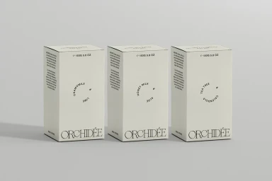
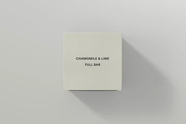
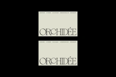
The brand identity for Orchidée expertly navigates the intersection of e-commerce platforms and premium retail, establishing a visual language that prioritizes editorial minimalism and sophisticated restraint. Through a series of clean, commercial product shots, the project emphasizes the tactility and materiality of the packaging, utilizing matte textures and a neutral, earth-toned palette to communicate a sense of intentional calm. The design execution relies heavily on the tension between bold, high-contrast serif typography and clean, modern sans-serif layouts, resulting in a cohesive brand system that feels both timeless and grounded in contemporary aesthetics. Paula Rodríguez Studio demonstrates a masterful command of composition, leveraging soft light and natural light techniques to provide depth to the minimalist packaging without relying on extraneous styling. This focus on negative space and balanced symmetry is mirrored in the business card designs, where the stark contrast of sage green and monochrome tones creates a refined, professional presence. By stripping away visual noise, the work ensures that the product—ranging from Chamomile and Lime to Tea Tree and Calendula—remains the primary focus. Every element, from the deliberate paper choice by Keaykolour to the precise linework of the logotype, serves to reinforce a brand image that is as functional as it is visually arresting, ultimately positioning Orchidée as a standout in the modern retail landscape.
Commercial, Clean, Minimalist
Typography

