
One Medical: Brand Identity


Jun 2019
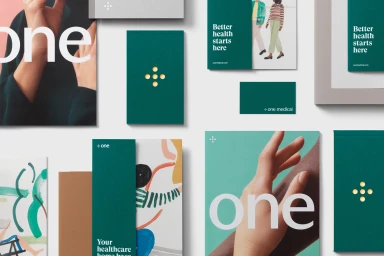
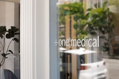
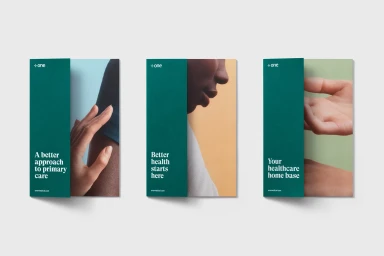
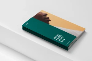
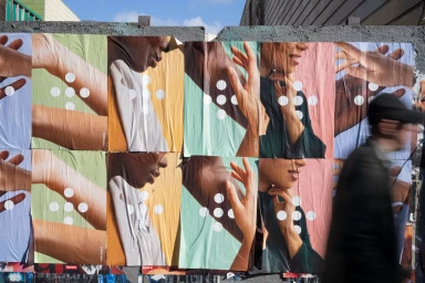
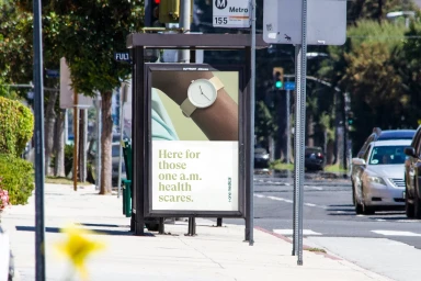
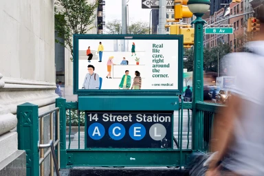
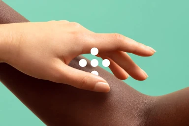
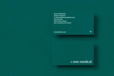
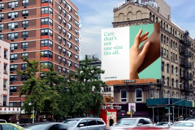
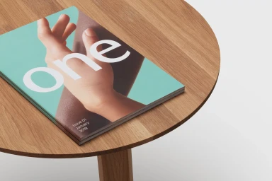
The brand identity for One Medical signals a sophisticated shift in the healthcare industry, moving away from sterile, clinical tropes toward a warm, human-centric aesthetic that feels both accessible and modern. Orchestrated with strategic precision by Moniker, the identity system leverages a deliberate, deep teal and sage green color palette to establish immediate visual recognition. Through the creative application of minimalist typography and a signature cross-icon formed by dots, the brand crafts a professional yet inviting language that speaks to both digital and physical touchpoints. This cohesive visual system finds life across diverse media, from high-contrast flat lay arrangements of marketing collateral to large-scale outdoor advertisements placed within the fast-paced urban environment of New York City. The execution leans heavily into editorial minimalism and soft light photography, emphasizing human connection through thoughtful imagery of hands and portraiture. By juxtaposing clean, sans-serif design with naturalistic, warm-toned photography, the project successfully balances corporate reliability with an approachable, lifestyle-oriented feel. Whether appearing on a sleek glass storefront or a digital billboard overlooking busy city traffic, the brand maintains a consistent, calm presence. This comprehensive design strategy effectively positions One Medical as a modern, empathetic force in primary care, utilizing UI illustration and tactile material choices to create a brand that feels as much like a trusted companion as it does a professional service.
Horizontal, Commercial, Clean
Typography
