
Okkaido: Brand Identity

Sep 2018
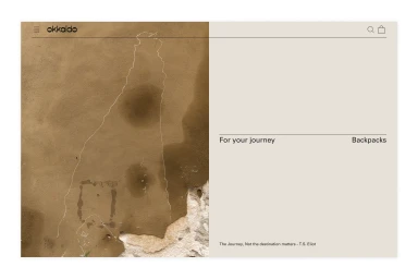
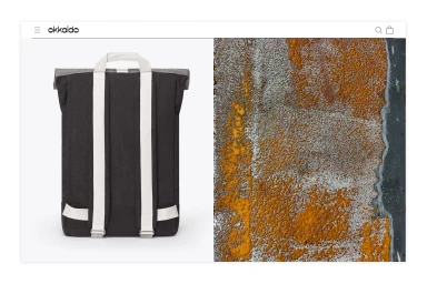
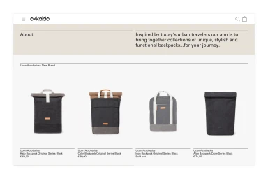
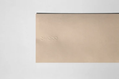
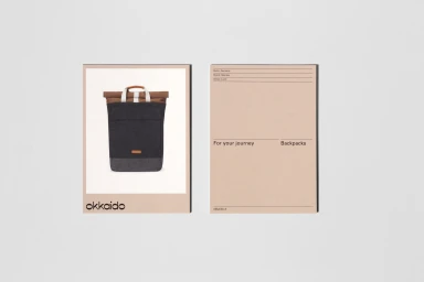
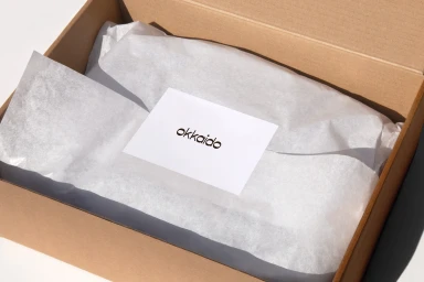
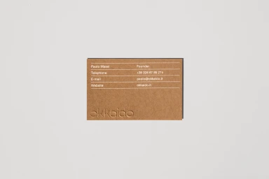
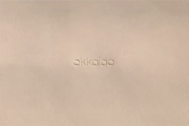
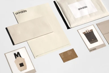
The brand identity for Okkaido establishes a visual language that balances industrial durability with a refined, high-end e-commerce experience. Developed by the design studio Vrints-Kolsteren, the project leans into editorial minimalism to elevate the everyday necessity of a backpack into a lifestyle statement. The creative strategy relies on a disciplined neutral palette, utilizing soft beige, light grey, and cream tones to ground the brand, while letting precise, high-contrast typography and thoughtful UI illustration do the heavy lifting. A core pillar of the visual system is the tactile nature of the materials; through subtle emboss and deboss techniques on stationery and packaging, the identity emphasizes a premium, physical presence that translates seamlessly to a digital environment. The use of soft light in studio photography highlights these textures, creating depth and a sense of luxury that feels both modern and methodical. By pairing clean sans-serif typography with abstract, weathered textures, the project bridges the gap between the rugged, functional aspects of the product and the elevated, curated aesthetic of the retail platform. This consistency across landing pages, shipping materials, and business collateral creates a cohesive narrative that reinforces the brand promise, effectively positioning Okkaido as a premium choice for the modern traveler looking for functionality without compromising on sophisticated, minimalist design.
Horizontal, Commercial, Clean, Minimalist
White Seamless
Website / Web
