
FORUM+
Brand Identity

Dec 2017
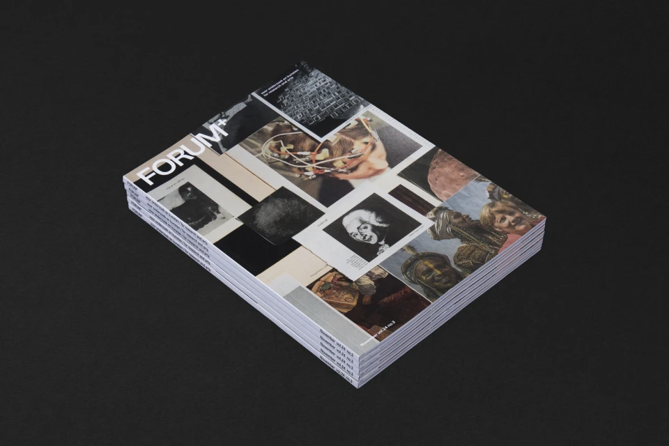
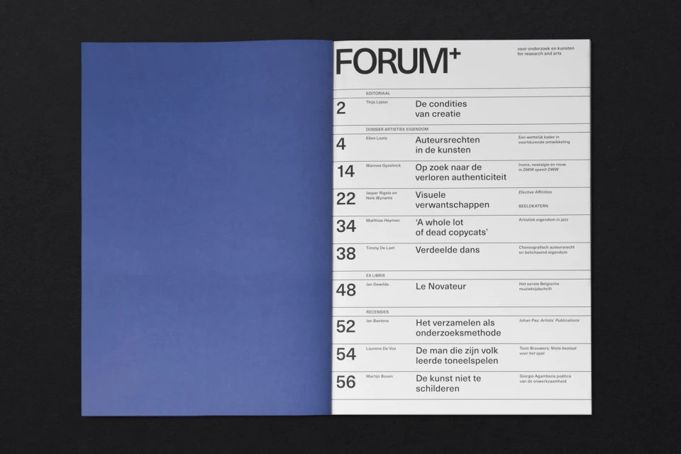
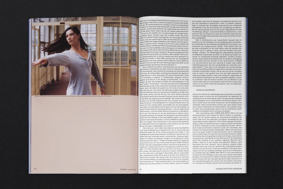
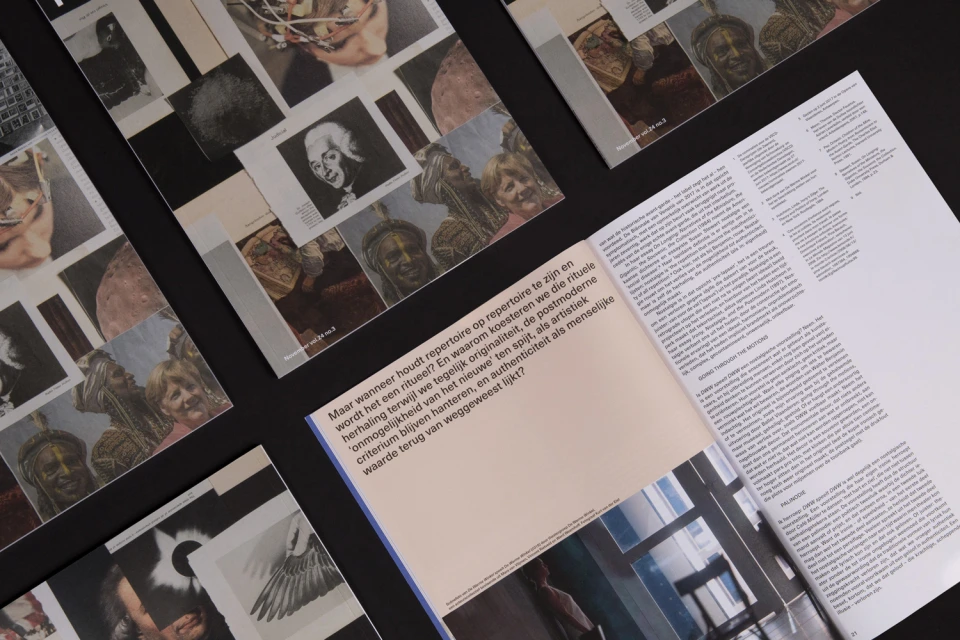
The brand identity for FORUM+ functions as a masterful exercise in editorial discipline, balancing high-concept visual storytelling with the structured rigour required for a contemporary research publication. Developed by the graphic design studio Vrints-Kolsteren, the project establishes a sophisticated visual language that feels both academic and deeply modern. At the heart of the publication is a commitment to editorial design that refuses to compromise on clarity, utilizing generous negative space, rigid horizontal grid systems, and sharp, sans-serif typography to anchor dense Dutch-language academic content. The design identity leans heavily into a deliberate contrast between stark, minimalist layouts and complex, layered collage techniques. By juxtaposing historical portraits with abstract graphic elements and tactile photography, the team creates a rhythm that keeps the reader engaged across both dense text-heavy spreads and expansive, clean-lined pages. This commercial aesthetic is further elevated by the use of high-contrast staging, which highlights the material quality of the print medium. Whether focusing on dance photography or structural iconography like a minimalist toaster graphic, the identity maintains a cohesive professional atmosphere. Through its careful attention to typography and spatial organization, FORUM+ successfully bridges the gap between traditional print media and forward-thinking design, resulting in a publication that feels as much like an art object as it does a research platform for the arts.
Horizontal, Clean, Minimalist, Editorial
Typography
Digital Media & Publishers
Editorial
