
Mol: Brand Identity
Oct 2018
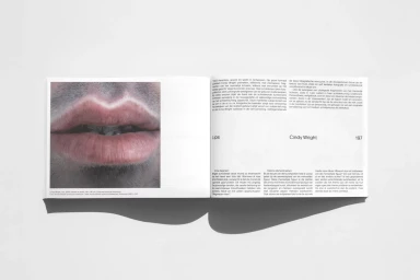
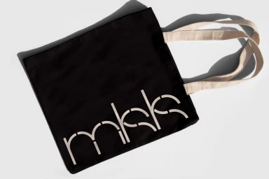
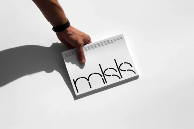
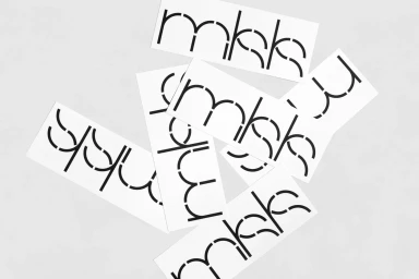
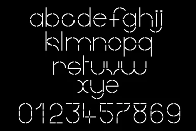
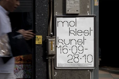
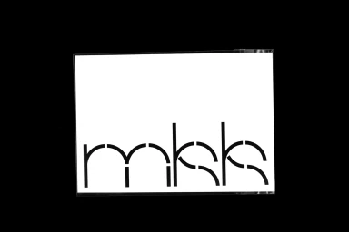
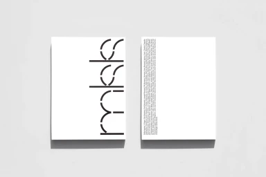
The brand identity for Mol serves as a masterclass in modern visual communication, balancing raw, industrial edge with refined, commercial precision. Developed through a meticulous design process by Vrints-Kolsteren, the system relies on a bespoke stencil-style typeface that defines the brand's modular and rhythmic visual language. Across a suite of collateral, including printed catalogues, minimalist merchandise, and environmental posters, the work channels a distinct editorial sensibility. The identity leans into a stark, monochromatic palette, utilizing high-contrast lighting and clean, negative space to elevate simple typographic forms into something tactile and architectural. Whether it is a packshot of a canvas tote featuring sharp, geometric shadows or a documentary-style capture of an exhibition poster layered against textured stone, the project remains grounded in a disciplined application of layout principles. This is design that transcends mere logo placement, instead creating an immersive ecosystem where every element—from the fragmented sans-serif strokes to the precisely aligned grid systems—communicates a cohesive, sophisticated narrative. By juxtaposing the visceral texture of oil-painted human forms within their editorial layouts against the clean, vector-based clarity of their stencil typography, the identity establishes a dialogue between human emotion and systematic logic. The resulting brand presence is both assertive and understated, proving that high-end corporate branding can achieve artistic resonance through intentional, minimalist restraint and a deep commitment to graphic fundamentals.
Horizontal, Clean, Minimalist
Typography
Advertising Campaign
