
Associated creatives

Tags
Description
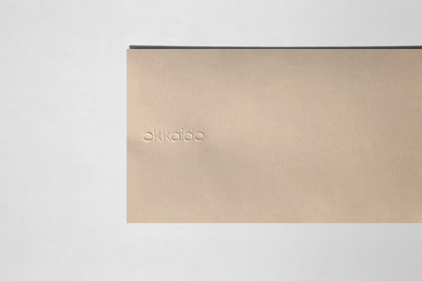
This image showcases a brand identity project for Okkaido, designed by graphic design studio Vrints-Kolsteren. A rectangular beige card with a tactile paper texture is positioned on a neutral light grey surface. The Okkaido logo is delicately debossed into the left side of the card, creating a subtle three-dimensional relief. A thin dark grey edge or layer runs along the top boundary of the composition. The minimal framing and clean, even lighting highlight the tactile qualities of the paper and the precision of the typography.