
Brand Identity


Feb 2018
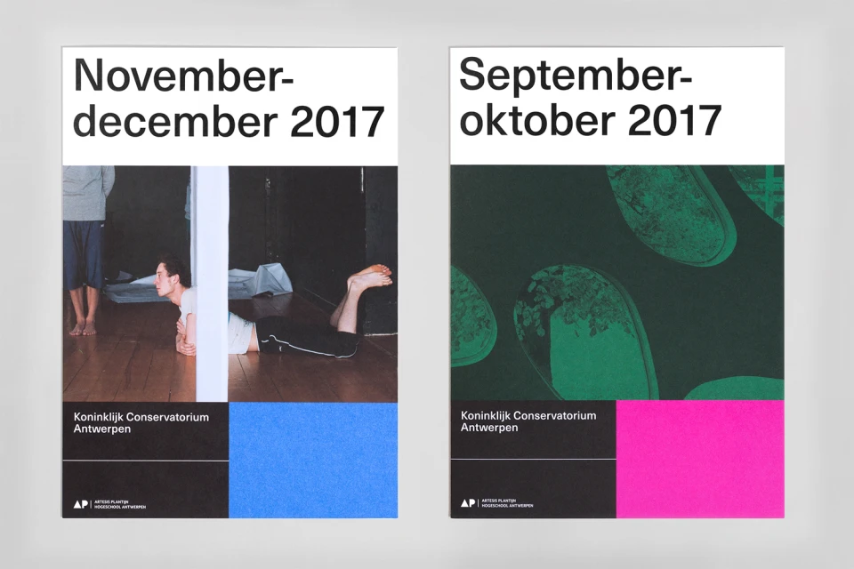
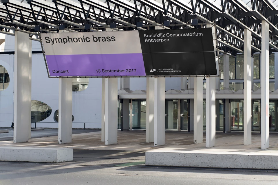
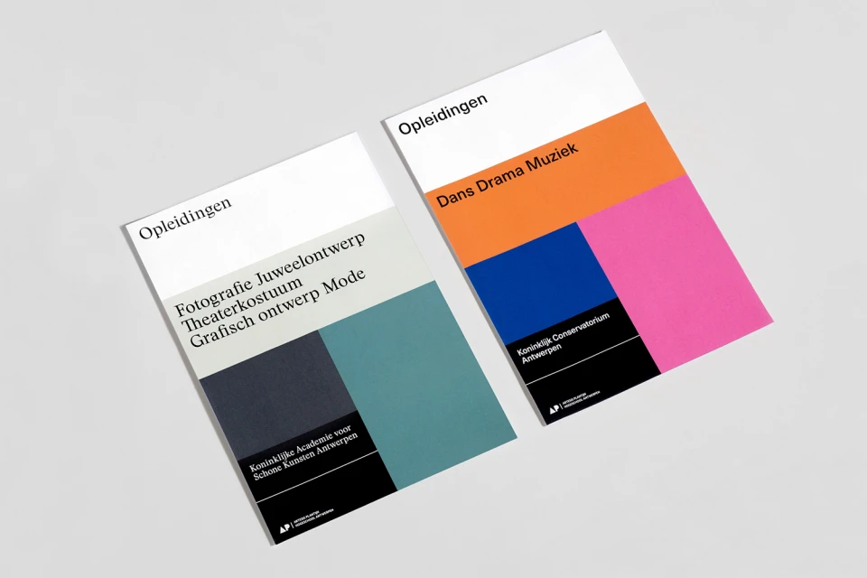
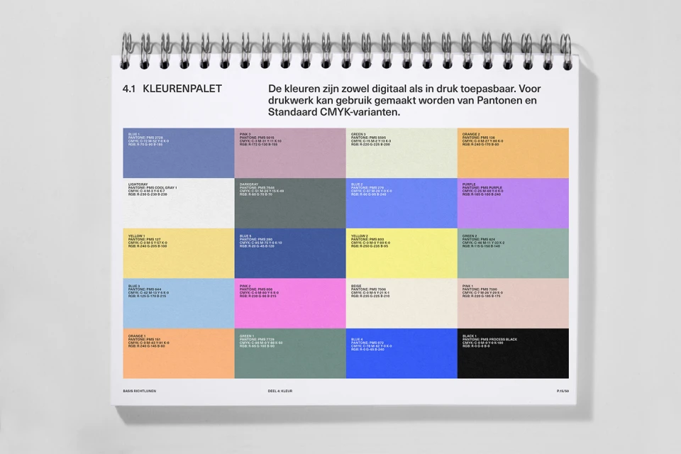
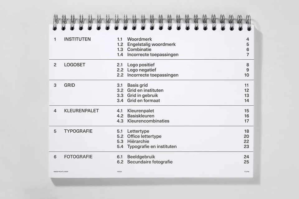
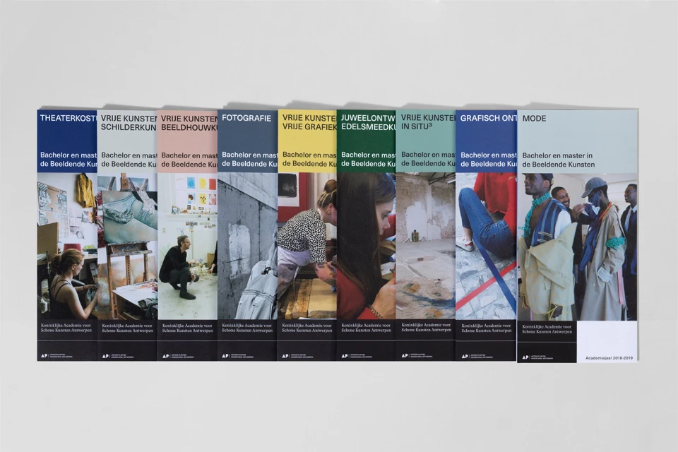
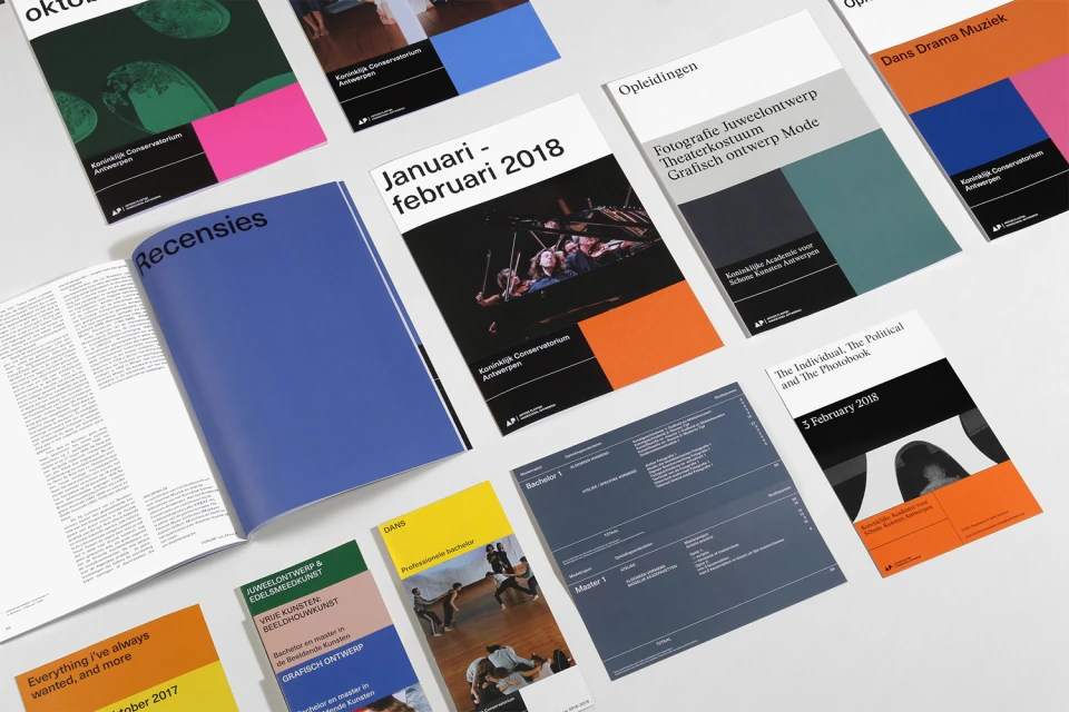
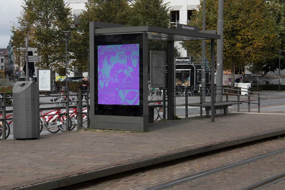
For the Koninklijk Conservatorium Antwerpen, the design studio Vrints-Kolsteren has developed a comprehensive brand identity that masterfully bridges the gap between institutional rigor and creative expression. This project serves as a sophisticated example of modern corporate identity design, emphasizing a modular system that scales across diverse touchpoints, from large-scale event banners suspended in architectural colonnades to detailed academic brochures and spiral-bound reference manuals. The aesthetic leans into a refined, minimalist layout characterized by bold sans-serif typography and a strategic use of negative space, which keeps the focus squarely on the content. By employing sharp, geometric colour blocks—ranging from muted teal and grey to vibrant orange and magenta—the studio achieves a cohesive visual language that remains flexible enough to represent departments as varied as photography, dance, and music. The technical execution is equally precise, as evidenced by the systematic colour palettes featuring exact Pantone, CMYK, and RGB values to ensure consistency in both digital and print mediums. Through this meticulous balance of structured typography and evocative photographic integration, Vrints-Kolsteren successfully elevates the academy's public-facing image, transforming standard academic materials into a coherent and striking brand experience that feels both contemporary and deeply rooted in a professional design tradition.
Clean, Horizontal
Typography
White Seamless
