
BrandOkkaido
ProjectBrand Identity
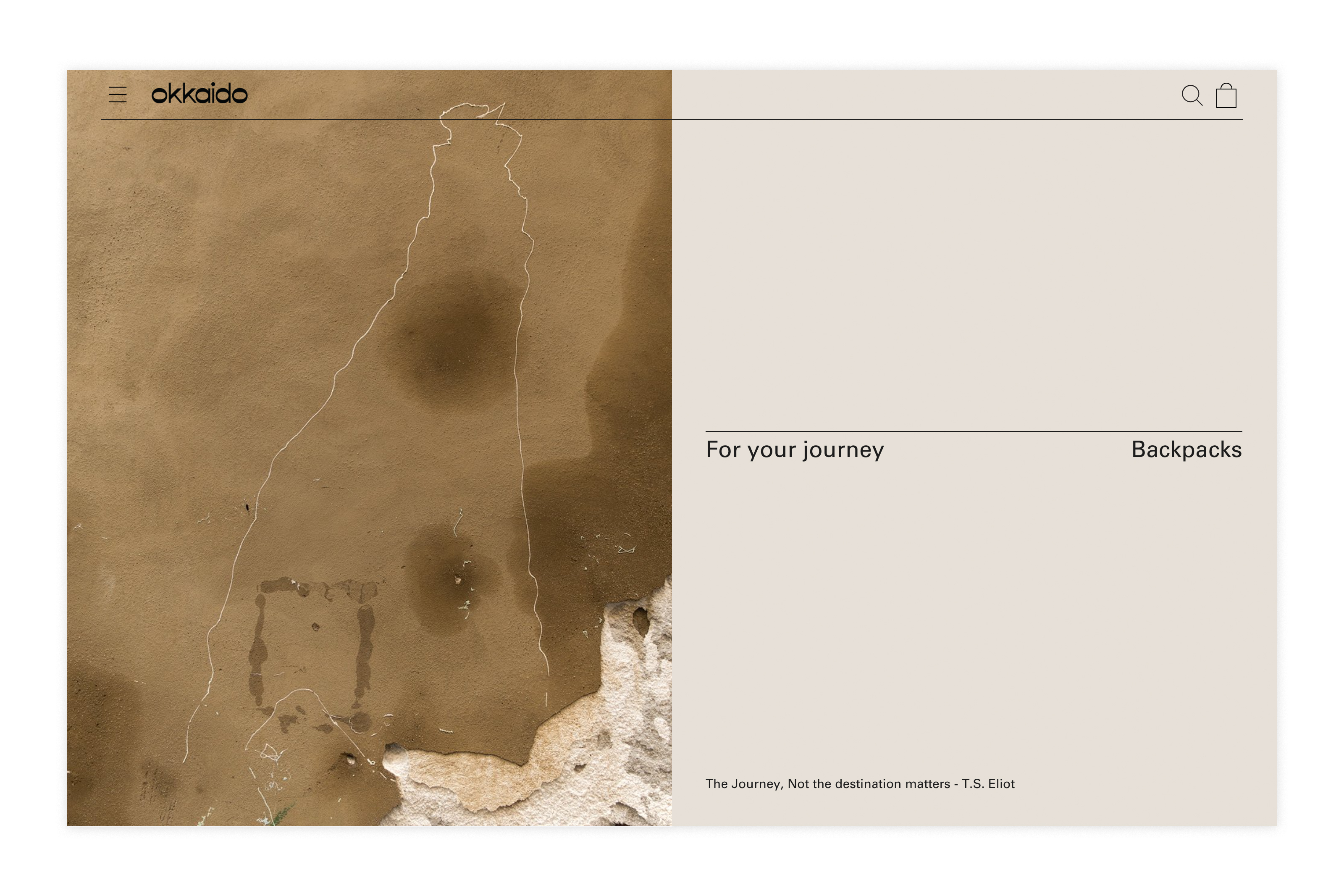
Okkaido Brand Identity 2018
Associated creatives

Tags
Description
This website interface design for the brand Okkaido features a clean split layout combining minimalist typography with a textured brown visual panel. Created by graphic design studio Vrints-Kolsteren as part of a brand identity project, the layout incorporates understated navigation, search and cart icons, and descriptive text including the tagline for your journey and a quote by T.S. Eliot. The interface relies on a neutral color palette, precise thin-line framing, and a balanced composition suited for modern e-commerce.
Style
Horizontal, Commercial, Clean, Minimalist
Techniques
Typography, UI illustration
Industries
E-commerce Platforms
Color
Beige (50%)
Caramel (50%)
Background
Solid Colour
Context
Website / Web