
- Home
- ·Projects
- ·Nueva Italia
- ·2020
- ·Brand Identity




Nueva Italia Brand Identity 2020
About
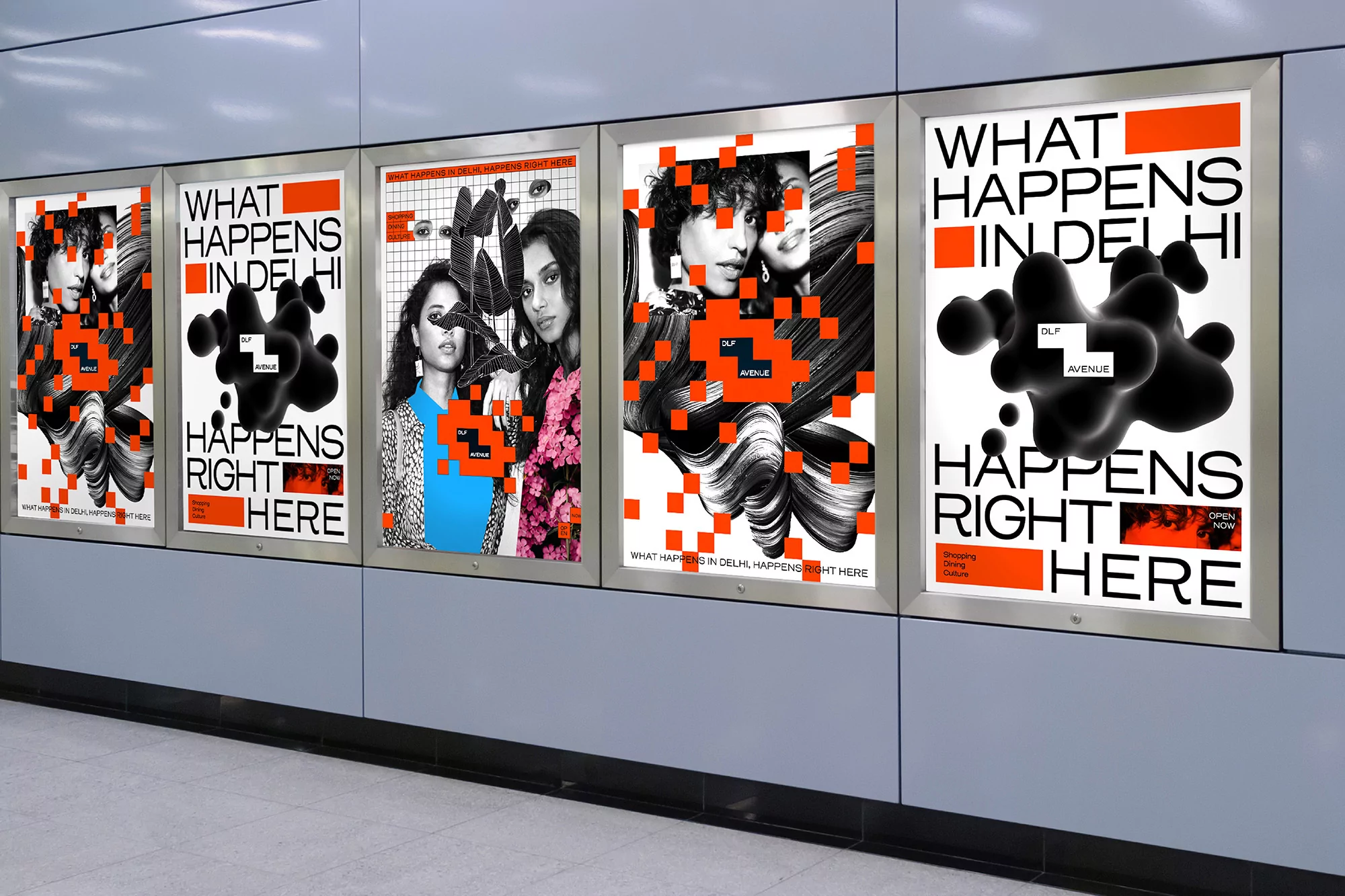
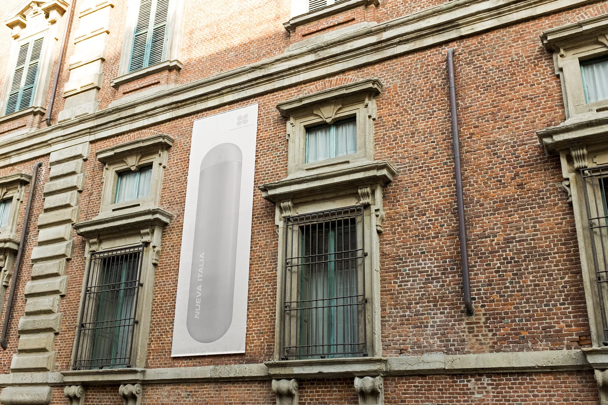
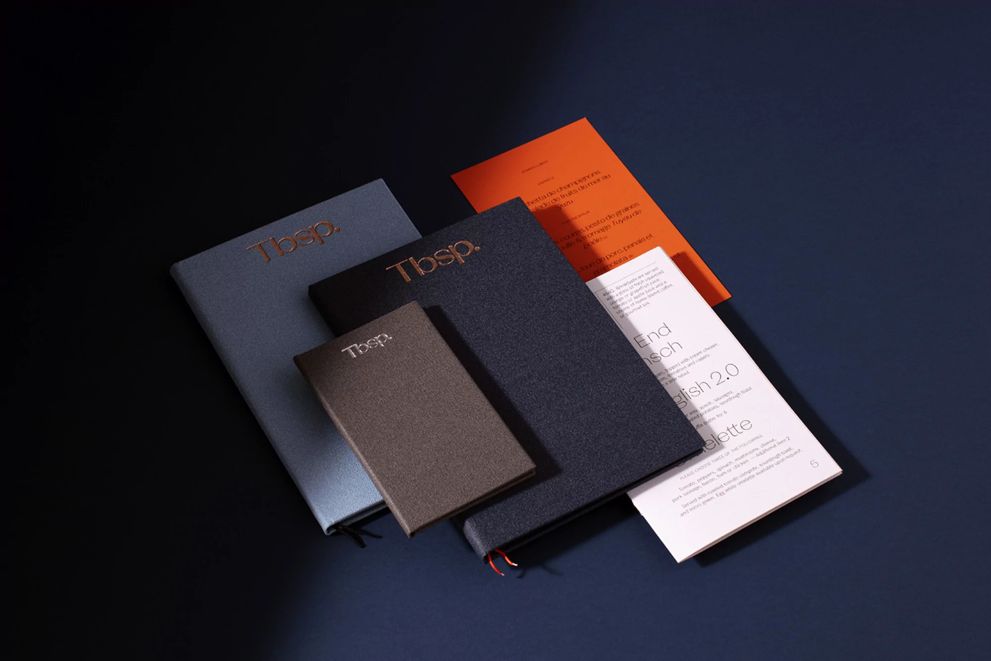
Nueva Italia establishes a sophisticated brand identity that seamlessly bridges the gap between traditional craft and contemporary corporate precision. The project leans into a minimalist aesthetic, utilizing high-contrast typography and intentional negative space to ground its visual language. Throughout the identity design, the work shifts effortlessly from editorial storytelling, featuring documentary-style imagery of agricultural labor, to the clinical clarity of 3D render and CGI product visualization. This versatility demonstrates a mastery of commercial design, where soft, diffused natural light meets the tactile elegance of emboss and deboss techniques on stationery. The branding remains cohesive across diverse touchpoints, including site-specific architectural installations on historic brick facades and modular graphic displays that define urban spaces. By pairing stark, amorphous shapes with structured, sans-serif layouts, the project maintains a professional yet artistic tension that feels both timeless and forward-thinking. Supported by the deliberate use of high-key lighting to emphasize material textures and geometric forms, the identity package feels curated and deliberate. Whether presenting the raw, gritty reality of agave harvesting or the refined, frosted surfaces of modern packaging, the visual system speaks to a brand that values authenticity alongside clean, high-impact public communication, ensuring a premium presence in any market it occupies.