
Neara: Brand Identity

Mar 2022
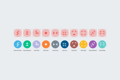
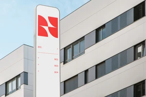
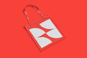
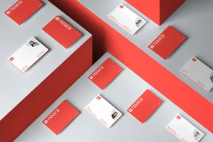
Mubien delivers the brand identity for Neara, a technology company focused on structured, grid-based visual systems. The work centers on a geometric icon set and a cohesive color palette, establishing a clean design language that spans both digital and physical applications. The project integrates these graphic elements into a range of commercial collateral, including wayfinding signage, corporate stationery, and apparel. Utilizing minimalist typography and vector-based construction, the identity emphasizes clarity and precision throughout each touchpoint. Execution across the identity is supported by 3D renders and photography, showcasing the logo and abstract geometric shapes within various outdoor and studio environments. The resulting system maintains consistency, balancing corporate utility with a distinct visual rhythm.
Horizontal, Commercial, Clean
Advertising Campaign
