
Mylo: Brand Identity

Sep 2020
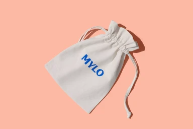
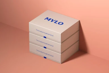
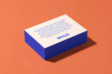
The brand identity for Mylo, executed by the team at Ragged Edge, marks a masterclass in modern minimalism and cohesive visual storytelling within the lifestyle and consumer electronics sector. By leaning into a sophisticated, monochromatic color palette of muted peach, tan, and vibrant blue, the project establishes a distinct visual language that feels both approachable and high-end. The execution relies heavily on deliberate 3D render and CGI techniques to present the product ecosystem, allowing the hardware to shine with ergonomic precision against clean, flat backgrounds. This commercial project effectively utilizes studio-lit photography and clean UI illustration to bridge the gap between tangible packaging and digital presence. The interplay between the bold, sans-serif typography and the soft, organic forms of the physical products creates a sharp, graphic contrast that grounds the identity in contemporary design principles. Every element, from the tactile texture of the product boxes to the carefully balanced composition of the stacked collateral, reflects a commitment to a minimalist aesthetic. Natural light qualities are harnessed to enhance the product's dimensionality, resulting in a cohesive brand image that is both utilitarian and highly curated. By focusing on the strength of the logo and the mission-driven messaging, the design ensures the Mylo brand leaves a lasting, personalized impression on its audience.
Commercial, Clean, Horizontal
Solid Colour
