
Mo Chara: Brand Identity
Sep 2021
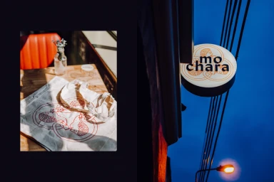
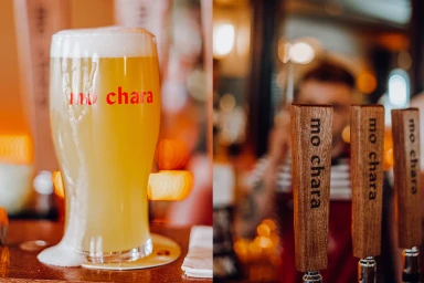
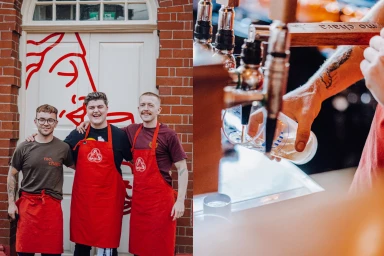
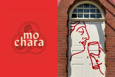
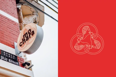
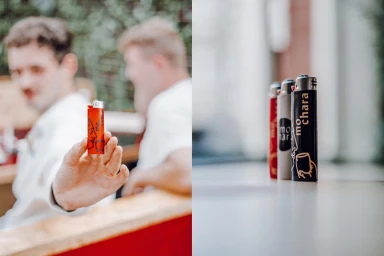
Mo Chara's brand identity development focuses on a clean, graphic-driven aesthetic that integrates minimalist line-art illustrations across multiple touchpoints. The project, executed by Grandson, establishes a visual language centered on a vibrant red palette contrasted against deep textures like brickwork and polished wood. The identity implementation spans diverse mediums, from environmental signage and staff apparel to custom merchandise like lighters and tote bags. By utilising natural light and a warm colour temperature, the photography captures an inviting hospitality atmosphere that leans into commercial, typography-focused storytelling. The design system features a distinct circular monogram and fluid, continuous-line illustrations that unify the establishment's physical space and promotional assets. Every element, including the metallic bar fixtures and branded glassware, reinforces a cohesive, vector-based visual presence.
Horizontal, Commercial, Clean
Advertising Campaign
