
Milamend: Brand Identity



Jan 2025
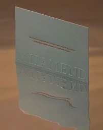
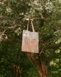
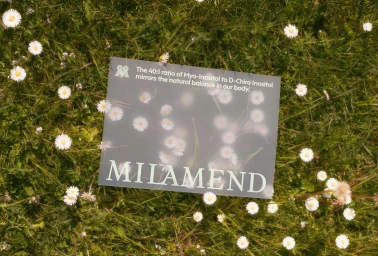
The brand identity for Milamend establishes a holistic visual language that bridges wellness and organic design. Developed by Visie Admin with graphic design from Parker and web development by Baggy, the project spans across product packaging, digital interfaces, and motion assets. The aesthetic is defined by a warm, earth-toned palette, minimalist typography, and a tactile emphasis on texture. Execution across the campaign leans into a nature-integrated approach, featuring product placements in lush meadows, woodland environments, and stylized water-reflective surfaces. Key techniques include clean 3D render/CGI for ingredient-focused sequences and fluid motion graphics to animate the brand's geometric monogram. The result is a cohesive presentation that translates the scientific nature of its dietary supplement formulations into a soft, approachable visual system.
Commercial, Horizontal, Warm

