
Maybe Sammy: Brand Identity
Oct 2021
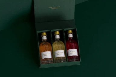
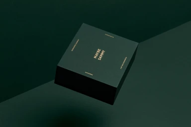
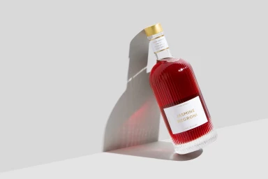
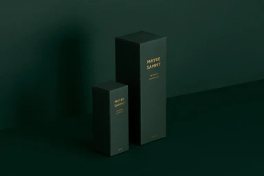
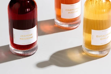
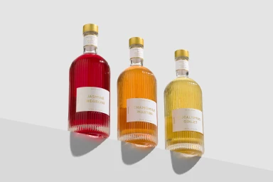
This brand identity project for Maybe Sammy centers on the tactile presentation of their bottled cocktail range. The visual system leverages a monochromatic dark green palette paired with gold embossed typography, creating a cohesive aesthetic across packaging and print collateral. Executed with a minimalist approach, the design uses clean geometric lines and premium paper stock to elevate the product presence. Photography by Foliolio highlights the ribbed glass textures and the saturated hues of the beverages through high-contrast directional lighting. Development of the identity was a collaborative effort, featuring graphic design by The Bar Brand People and print production by Contain Design Studio. The project employs a refined commercial style that emphasizes material quality and structural form.
Horizontal, Commercial, Clean, Minimalist
E-commerce / Product


