
Three Norfolk: Brand Identity


Dec 2021
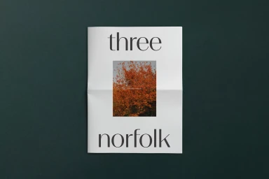
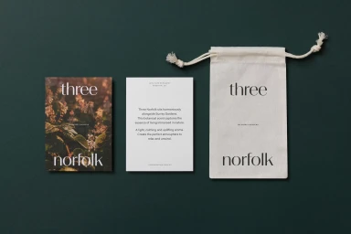
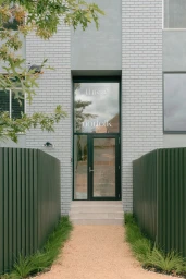
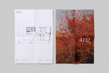
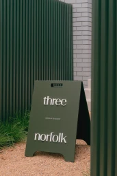
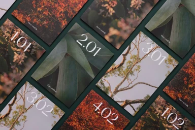
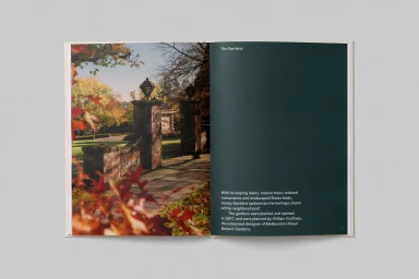
Three Norfolk presents a comprehensive brand identity that centers on a minimalist editorial aesthetic and a deep, nature-inspired palette. The identity system is defined by elegant serif typography and a consistent use of earthy, botanical-focused imagery that bridges the gap between physical collateral and architectural signage. Developed with graphic design from Studio Brave and photography by Foliolio and Gavin Green, the project extends across a range of applications. These include detailed real estate brochures featuring technical floor plans, custom product packaging for essential oils, and onsite signage that integrates with modern architectural elements like grey brick and corrugated metal. Each touchpoint reinforces a clean, balanced presentation through a restrained grid system and precise, intentional white space.
Horizontal, Clean, Commercial


