
Matty Matheson: Brand Identity
Mar 2026
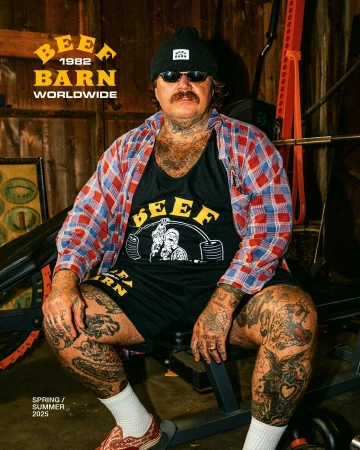
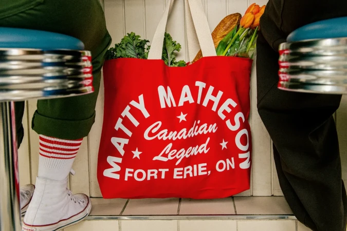
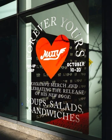
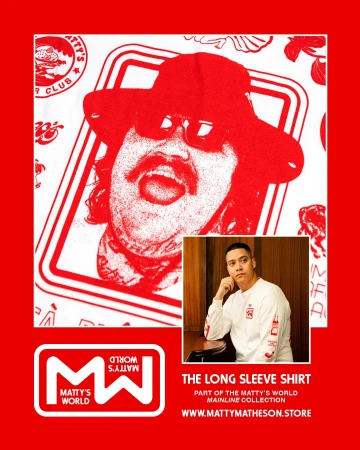
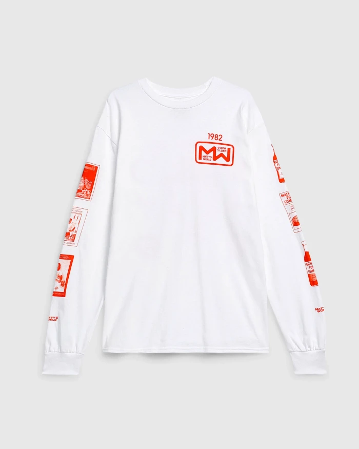
The Matty Matheson brand identity project captures the unfiltered, high-energy ethos of the iconic chef through a multifaceted visual language that bridges the gap between culinary culture and modern streetwear. By synthesizing lifestyle portraiture with punchy, graphic-forward promotional design, the project creates a cohesive aesthetic that feels both raw and calculated. The imagery leans into a rugged, authentic lifestyle aesthetic, utilizing natural light to highlight the grit of the Beef Barn environment before transitioning into the polished, commercial precision required for high-end merchandising. Central to this visual shift are the contributions of designers like Ross Proulx and illustrators such as Atlas Opera, whose work brings a bold, high-contrast typography to the forefront of the brand. Whether through the clean, studio strobe lighting used for e-commerce product displays or the 3D render and CGI techniques employed in his stylized promotional posters, the brand identity project maintains a consistent pulse. Photographers Sid Zheng Tang and Christopher Sherman expertly balance the intimacy of portrait photography with the structured needs of a commercial campaign. The final result is a versatile design system that successfully promotes a range of culinary projects, from cookbook releases to pop-up merchandise events, grounding the brand in a distinctly Canadian, legend-driven narrative that feels entirely authentic to Matheson's larger-than-life persona while remaining commercially sharp, visually memorable, and structurally sound for modern multi-channel marketing.
Commercial, Horizontal


