
Market Art Fair: Brand Identity




Sep 2025
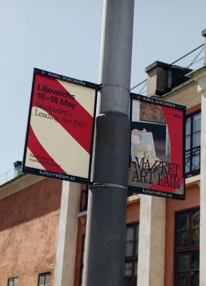
The brand identity for Market Art Fair, developed by 25AH, establishes a cohesive visual language across both physical and digital touchpoints. The project leans into minimalist design principles, utilizing bold, high-contrast typography and a restricted red-and-cream palette to ground the exhibition’s presence within an architectural context. By pairing sharp graphic systems with editorial photography by Mira Wickman, the identity effectively bridges the gap between printed collateral and environmental signage. The execution encompasses a broad range of applications, from responsive website design and digital interface layouts to tactile event materials like custom invitations and fair maps. Photography captures the identity in situ, utilizing natural light and clean compositions to highlight the material quality of the paper stocks and the integration of the fair’s graphics with historic building facades. Motion graphics and horizontal scrolling sequences further extend the visual narrative, ensuring a consistent application of the fair's aesthetic across promotional banners and screen-based media.
Horizontal, Clean
Natural light

